A travel agency in Corfu, in a market where every agency on the island communicates in exactly the same way.
Clean typography in the mark and, around it, a system of line icons that builds up the experience of travel itself.
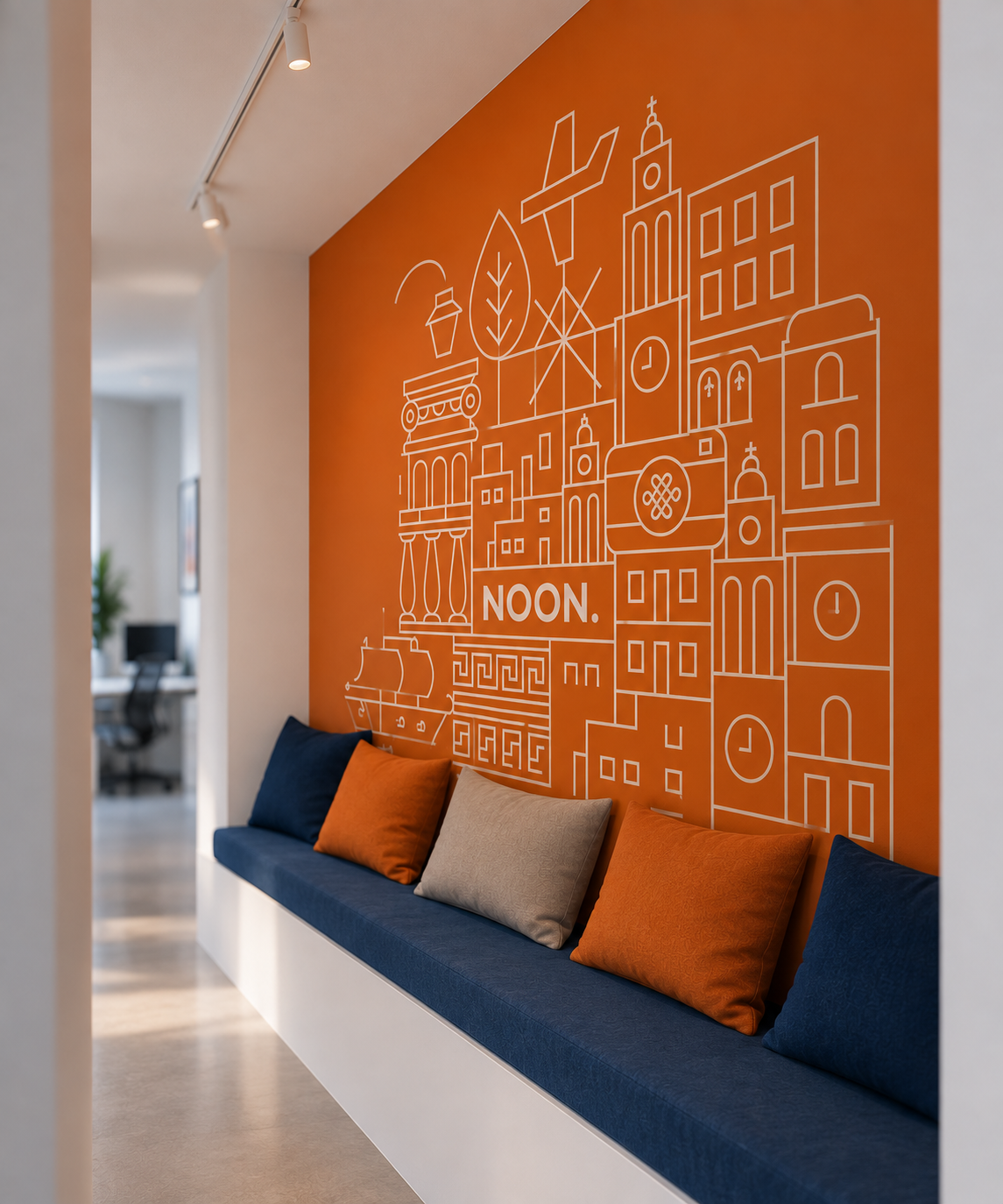
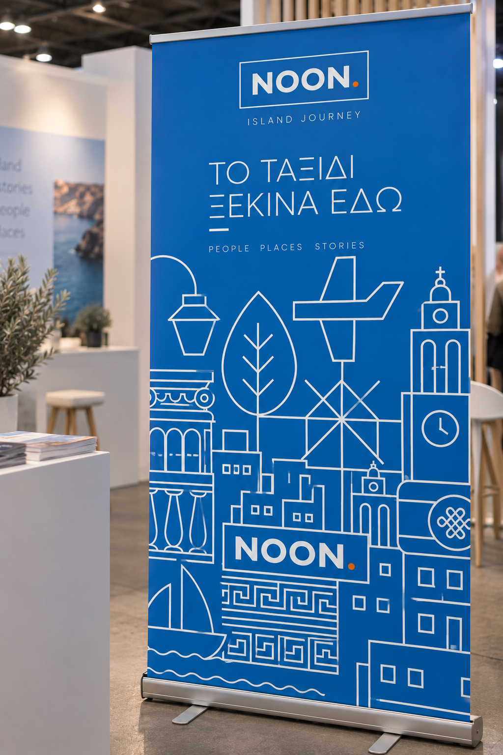
An identity that works at every scale — from the business card to the office wall and the car.
Noon Island Journey
Noon Island Journey is a travel agency in Corfu, serving visitors to the island and travellers heading to any destination. The name comes from the family surname, Mesimeri (Greek for "midday"), rendered in English.
When a client gives you real freedom, the responsibility grows instead of shrinking. Here we chose not to show a single photograph of a destination. A journey isn't only the place; it's the ticket, the route, the table you book for dinner. Those are exactly what we designed, one by one, and we let them build the agency's image.


How it came together
- 01
Research & challenge
In Corfu, travel agencies almost all communicate the same way: destination photographs and loud colours. The client has trusted us for years and gave us complete freedom, so the brief was put plainly: a contemporary image unlike any other on the island. The agency doesn't just sell accommodation — it organises plane, ferry and bus tickets and travel insurance, and recommends where to eat, where to drink and what to see.
- 02
Idea & design
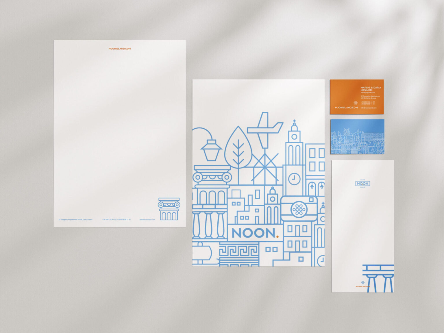
The logo was kept purely typographic, to leave room for whatever would be built around it. We designed a set of line icons that express the services and the place: buildings and landscapes of Corfu and the islands, means of transport, food and drink, sights. Each icon stands on its own, but composed together the icons become a pattern that covers surfaces at any scale. The palette came from the light of the place itself: a clean blue for sky and sea, an orange like the sun as it leans towards sunset, and a 45% grey for balance.
- 03
Delivery & result
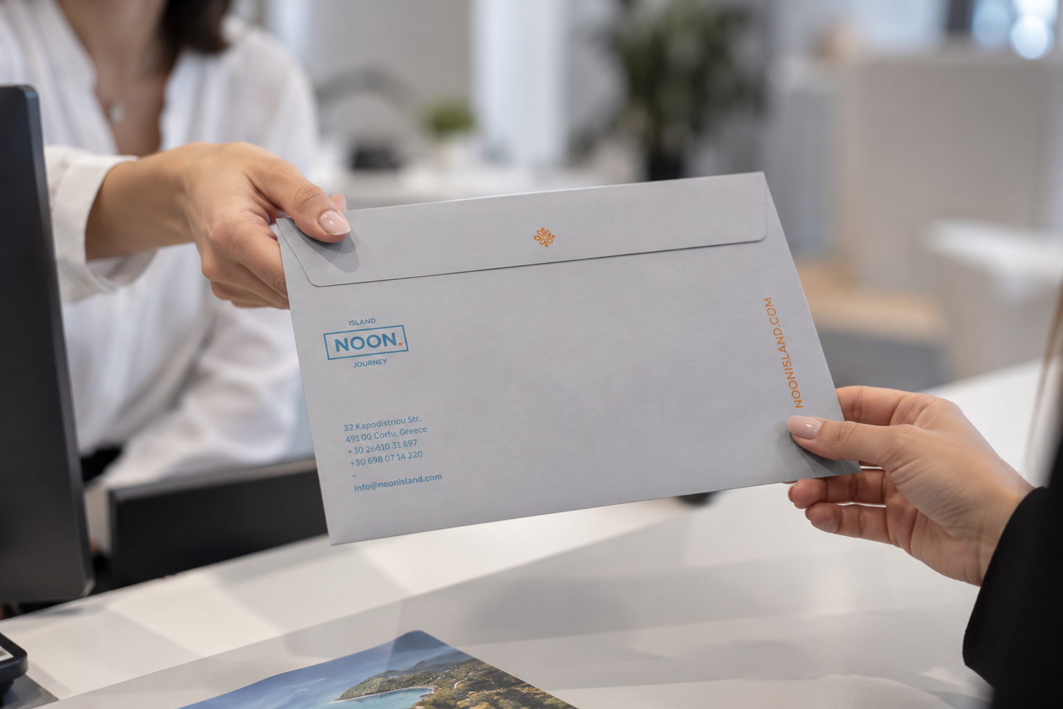
We delivered full stationery — letterheads, envelopes, folders and business cards — signage, the wrap for the company car, which had been ordered in blue and orange from the start, and the website content in Greek and English. The cards became the talking point: two coloured papers, one blue and one orange, laminated together, with white screen printing on the surface. Many visitors ask for them and keep them as a souvenir. In the office, the icon pattern dresses an entire wall. The collaboration continues with every new application the business needs.