

Packaging for Cheese & Dairy Products
Short answer: Cheese and dairy packaging has to do three things at once: stand out in the supermarket fridge or on the delicatessen shelf;
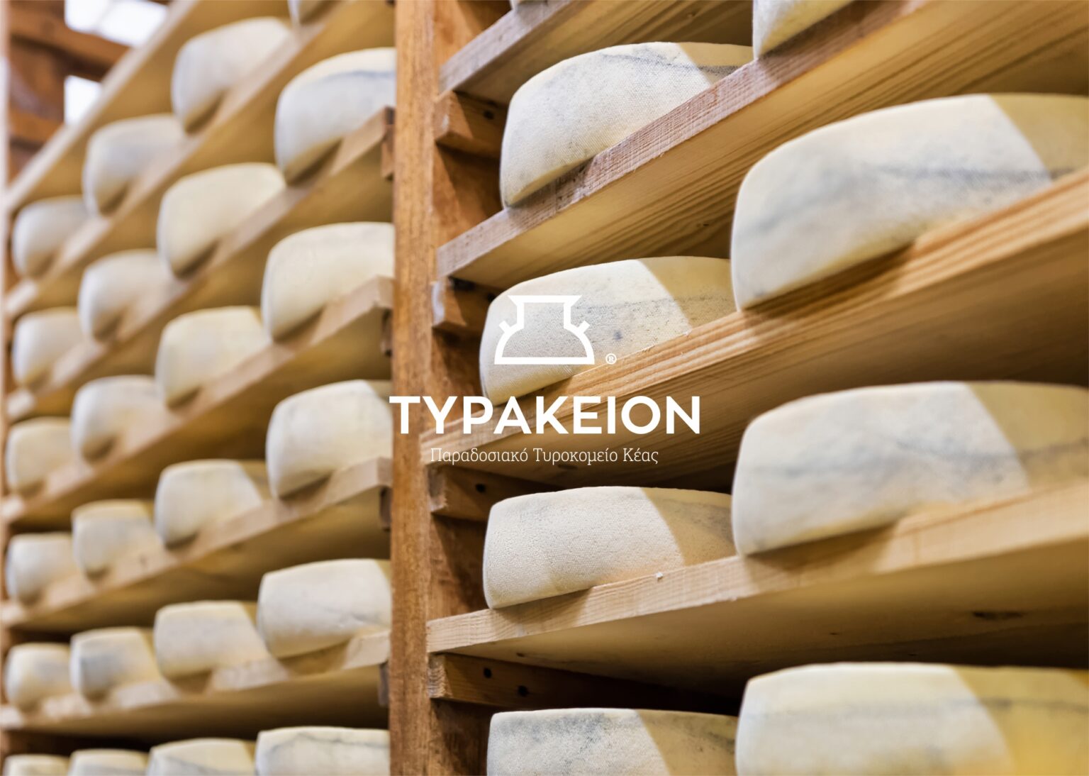
Short answer: Cheese and dairy packaging has to do three things at once: stand out in the supermarket fridge or on the delicatessen shelf; fit every piece of mandatory information that food law requires (in the EU, mainly Regulation 1169/2011); and withstand moisture, refrigeration and brine without peeling or smudging. At Poua Design we applied this to Tyrakeion, a family cheese dairy on Kea, where the cheese label and the milk bottle were designed as one single system.
Why cheese and dairy packaging is a category of its own
In packaging design generally, the designer has a fair amount of freedom: choose the paper, the shape, the finish, and build the image around the product. With cheese and dairy that freedom is limited by three realities.
The first is the environment. The product lives in the fridge, at a few degrees, with condensation forming on its surface every time it comes out. Many cheeses are packed in brine, wax or vacuum. A label that works perfectly on a jar of honey can wrinkle within a week on a tub of feta.
The second is the law. Foods of animal origin carry more mandatory information than almost any other category, and all of it has to fit on a surface that often measures just a few centimetres.
The third is competition. A small cheese dairy sits in the same fridge as large dairy companies. It doesn’t have their advertising budget, so the packaging is almost the only means it has to persuade a buyer within a few seconds.
The Tyrakeion example on Kea
Tyrakeion is a traditional cheese dairy on Kea. When the new owner took over the family business, he wanted to modernise it in equipment and image without losing its island, traditional character. The brief was for the products to stand next to branded cheeses on the shelf and in delicatessens.
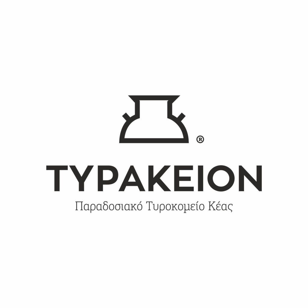
We started with the logo. It was drawn from the milk churn, the vessel in which cheesemakers collect milk: an object every producer recognises, which instantly conveys the idea of a handmade process. For the palette we chose black and yellow. Yellow is the colour we instinctively associate with cheese, and it gives the product visibility from a distance in a full fridge, while black keeps the image serious and legible.
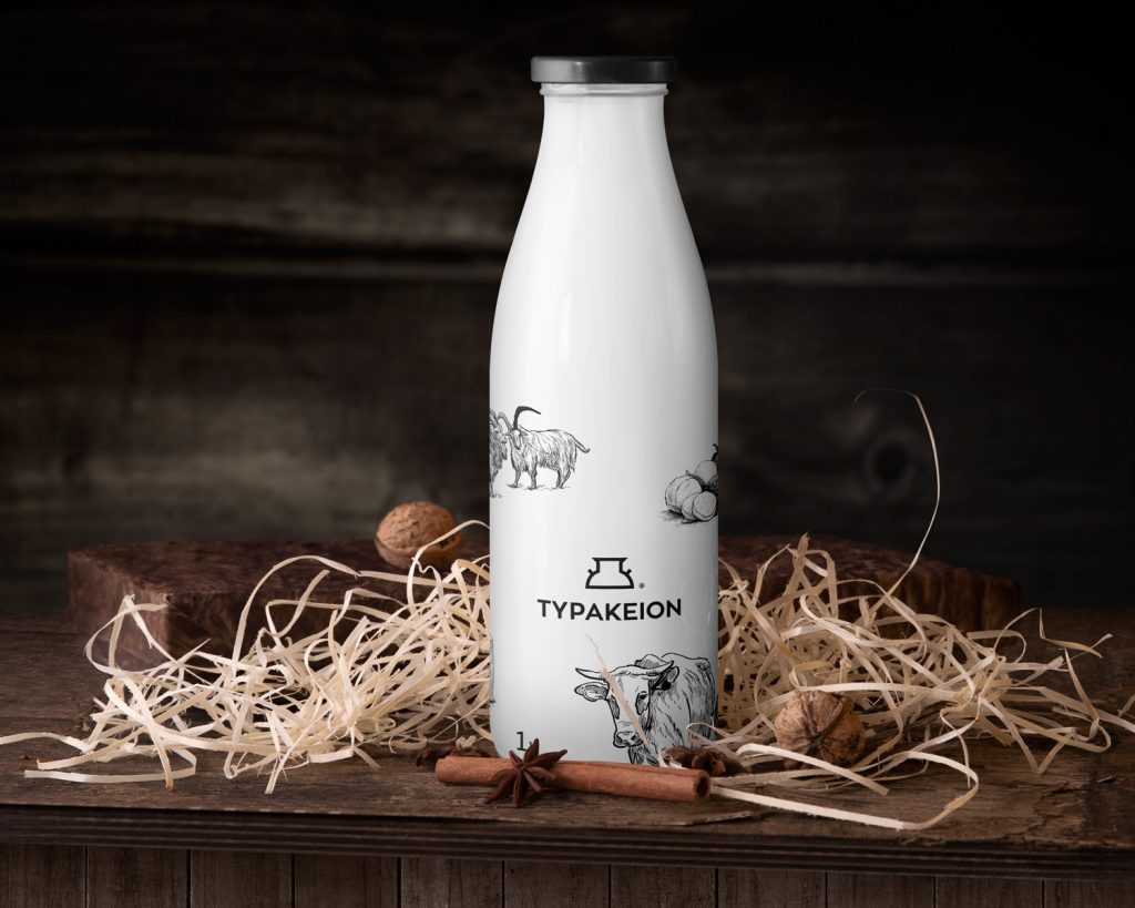
From there we designed the corporate identity and the product packaging: labels for the cheeses, application on the milk bottle, shop sign and print. In every application we made sure the old and the contemporary sit in balance, so the customer understands at once that this is a traditional island product with a professional presence.
Mandatory information on cheese and milk labels
Food labelling in the European Union is governed mainly by Regulation (EU) 1169/2011. For cheese and dairy, hygiene rules for foods of animal origin apply as well. In practice, a label has to fit:
Name, ingredients and allergens
The name of the product, the list of ingredients, and allergens highlighted within that list, for example in bold. In dairy, milk is itself an allergen, so the emphasis isn’t optional. The animal the milk comes from (cow, sheep, goat) should also be clearly visible, because it’s one of the first things buyers look for.
Net quantity and date
The net quantity, in the same field of view as the name. A “use by” date for perishables such as fresh milk and soft cheeses, or a “best before” date for matured cheeses. Because date and batch change with every production run, we design a clean field from the start so they can be printed or stamped without running over the artwork.
Storage, producer and nutrition declaration
Storage instructions (for example, keep refrigerated below a given temperature), the name and address of the food business operator, the country or place of origin where required, and the nutrition table.
Identification mark and PDO
Products of animal origin carry the oval identification mark with the country code and the approval number of the establishment. If the product has Protected Designation of Origin, like feta, the European PDO symbol is used as well. These have a prescribed form and aren’t “freely designed”: we build them into the layout so they’re clearly visible without dominating.
The regulation also sets a minimum character size for mandatory information: an x-height of at least 1.2 mm, or 0.9 mm when the largest surface of the packaging is under 80 cm². This is exactly where design is tested, on a small wheel of cheese or a yoghurt pot: the hierarchy must leave room for the information without burying the logo. The producer always confirms the final content with their food technologist; our job is to make sure it fits properly, legibly and consistently across the whole range.
Materials and printing: what survives the fridge and the brine
A cheese label is one of the most demanding jobs in print production. Unprotected paper absorbs moisture, general-purpose adhesives lose their grip at low temperatures, and inks rub off on the seller’s hands.
For refrigerated products we usually recommend labels on a synthetic substrate such as polypropylene, or on paper with a protective varnish or lamination, with an adhesive suited to cold and humidity. For tubs of brine, we check whether the label will come into contact with liquid and where exactly it will be applied. For cheese in wax or vacuum packs, the label often goes on a second layer: a band, a paper wrap or a hang tag.
When printing happens directly on a material that touches food, inks and materials suitable for food contact are needed. We discuss this with the printer before the design is locked, not after the first thousands are printed. We always ask for a proof on the real packaging and leave it in the fridge for a few days before giving final approval.
From one label to a whole range
A cheese dairy rarely sells just one product. It has graviera, soft cheese, mizithra, yoghurt, milk — and adds something new every year. If each label is designed separately, two years on the fridge looks like a collection of different businesses.
That’s why we design a system, not individual labels. A fixed position for the logo, a fixed zone for the mandatory information, a colour or pattern that changes per product for quick recognition, and a template the printer can adapt to a new size without starting from scratch. That’s how we worked at Tyrakeion, where the same logic runs from the cheese to the milk bottle to the shop sign. We take the same approach with family businesses that modernise their image without cutting themselves off from their history, as at Avgerinos Wooden Projects.
If the business also serves food or sells at its production site, the identity continues into menus, bags and signage. More on that in our guide to branding for restaurants and food businesses.
How we work at Poua Design
We start with a visit or a conversation about production: which products exist, in what packaging, where they’re sold and who buys them. We look at the fridges where the product will stand and at the competitors beside it. We ask the producer for the mandatory-information texts as approved by their food technologist.
Then we present two or three design directions at real size, with the information already in place, because a design that looks wonderful without it often collapses once it’s added. Once a direction is chosen we apply it across the range, prepare print files with correct margins, colours and die-cut, and supervise the proof at the printer.
Frequently asked questions
Which information is mandatory on a cheese label?
Under Regulation (EU) 1169/2011: name, ingredients with allergens highlighted, net quantity, use-by or best-before date, storage conditions, the food business operator’s details, origin where required, and a nutrition declaration. Cheeses also carry the oval identification mark of the establishment and a batch number. The producer’s food technologist confirms the final content.
Which label material withstands the fridge and moisture?
Usually a synthetic substrate such as polypropylene, or paper with a protective varnish or lamination, always with an adhesive suited to cold and humidity. Before final production we test on real packaging in the fridge.
Can a small cheese dairy have professional packaging without a large budget?
Yes. We design a base label template that changes only in colour and name per product, so the range prints affordably in small quantities and extends easily when new cheeses are added.
Do I need a logo before we design packaging?
Not strictly, but it helps. At Tyrakeion we designed the logo first, based on the milk churn, and then the packaging, so everything speaks the same language. If you already have a mark in good condition, we build on it.
How long does cheese and dairy packaging design take?
For a small range of labels, usually 3 to 6 weeks from approval of the proposal to final files, depending on the number of products, print tests and how quickly the information texts are finalised.
Do I need a barcode on the packaging?
If the product will be sold in supermarkets or larger delicatessens, almost always yes: an EAN barcode, obtained through GS1 (in Greece, GS1 Greece). We plan its position and size from the start so it scans properly, even on a curved surface.
Let’s design your product packaging
If you run a cheese dairy, a farm or a dairy production unit and want your packaging to stand next to the big brands without losing its character, we can design it together, from logo to final print. Contact us for a first conversation or see all Poua Design services.
Founder, graphic designer & creative director of Poua Design. She has been designing identities, packaging and print in Athens for 15+ years.
WHO WE ARE →