A long-established builder passing to the second generation, wanting an image as modern as its work.
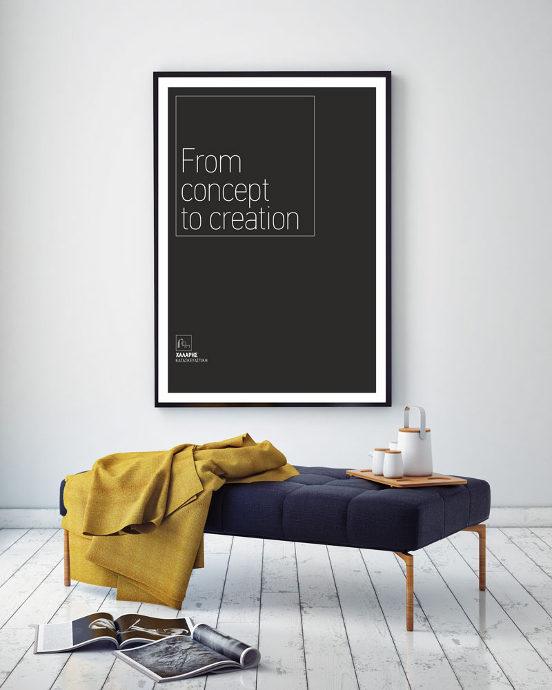
A geometric mark that forms a house, plain typography with nothing superfluous, and a motto: "From concept to creation".
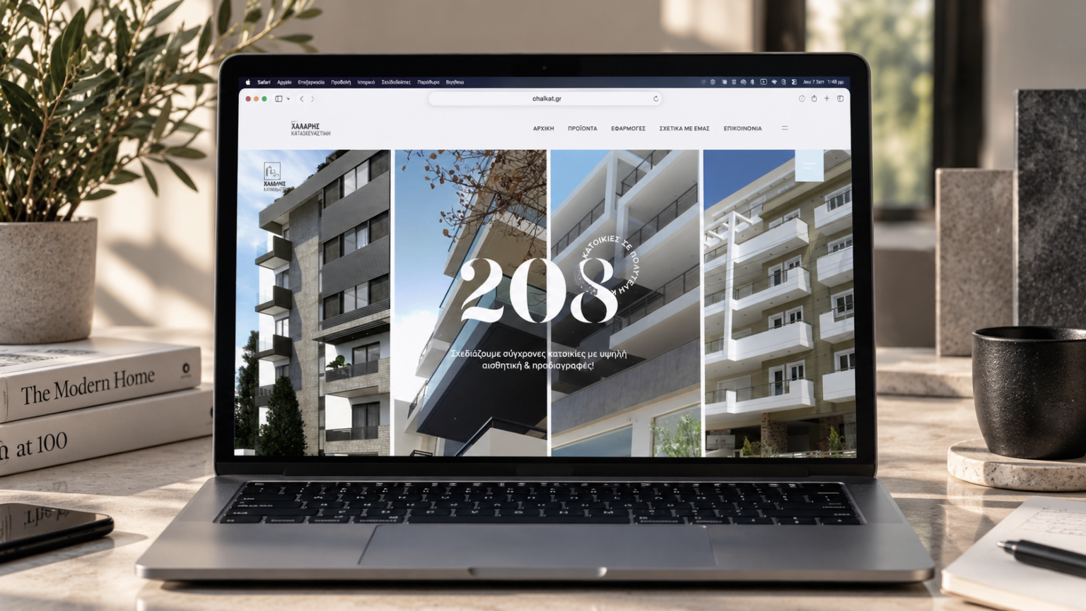
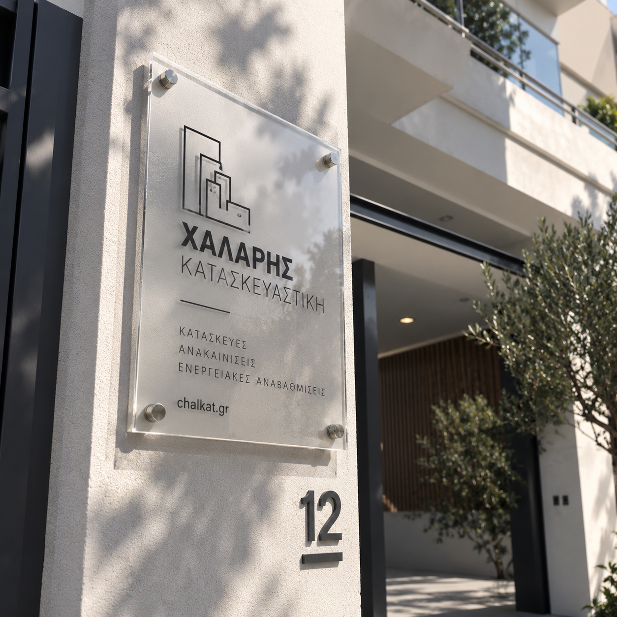
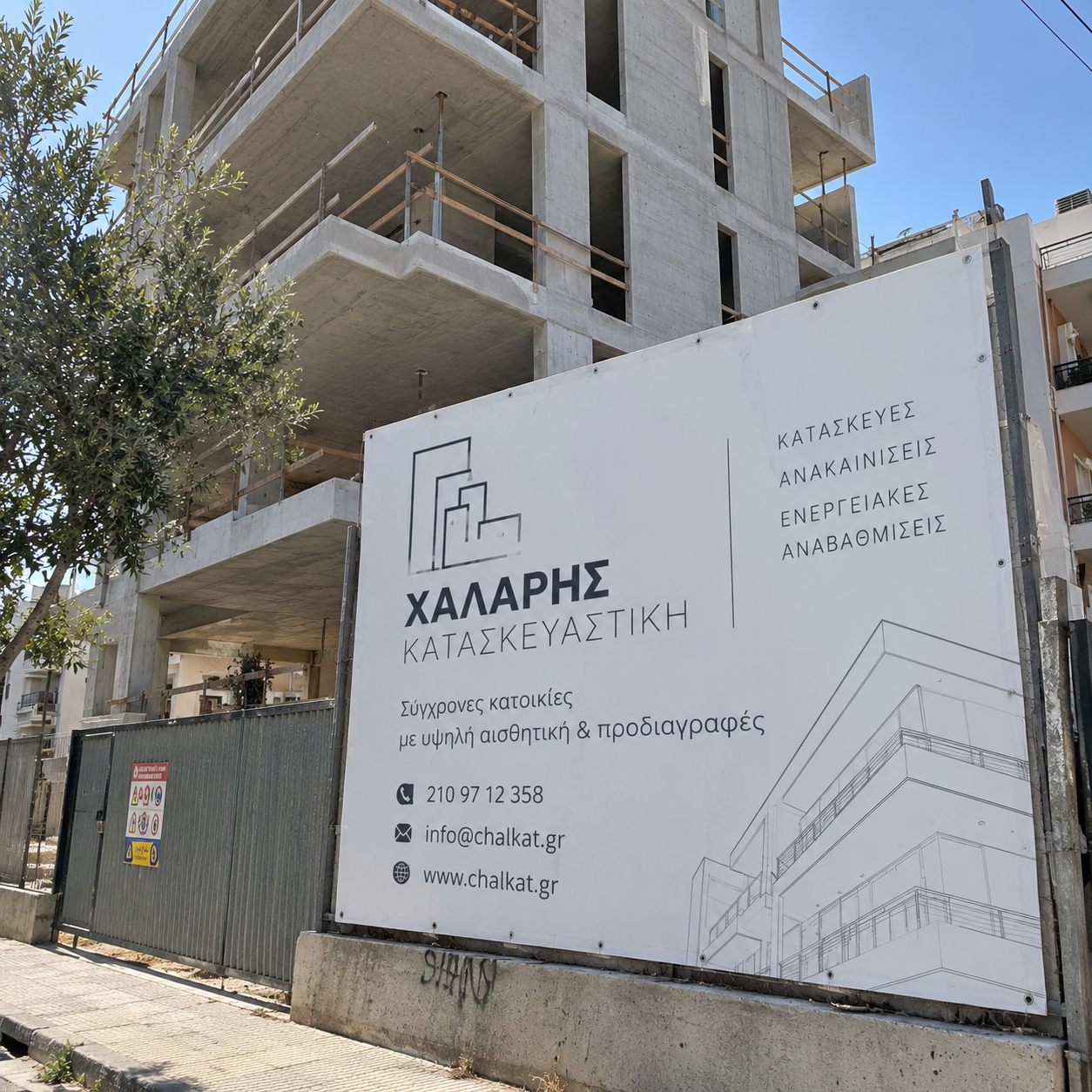
An identity that is recognisable from the site hoarding to the website, with continuous support on the digital side.
Chalaris Construction — a corporate identity rebrand
Chalaris Construction builds apartment blocks — flats and shops — from its base in Agios Dimitrios. It is a family business with many years in the field, passed from the father to his two children; the son, a civil engineer, took on the task of giving it the image it deserves today.
We designed the original logo and corporate identity for Chalaris Construction in 2015. Today a rebranding was necessary, to give the business a fresh, modernised air.
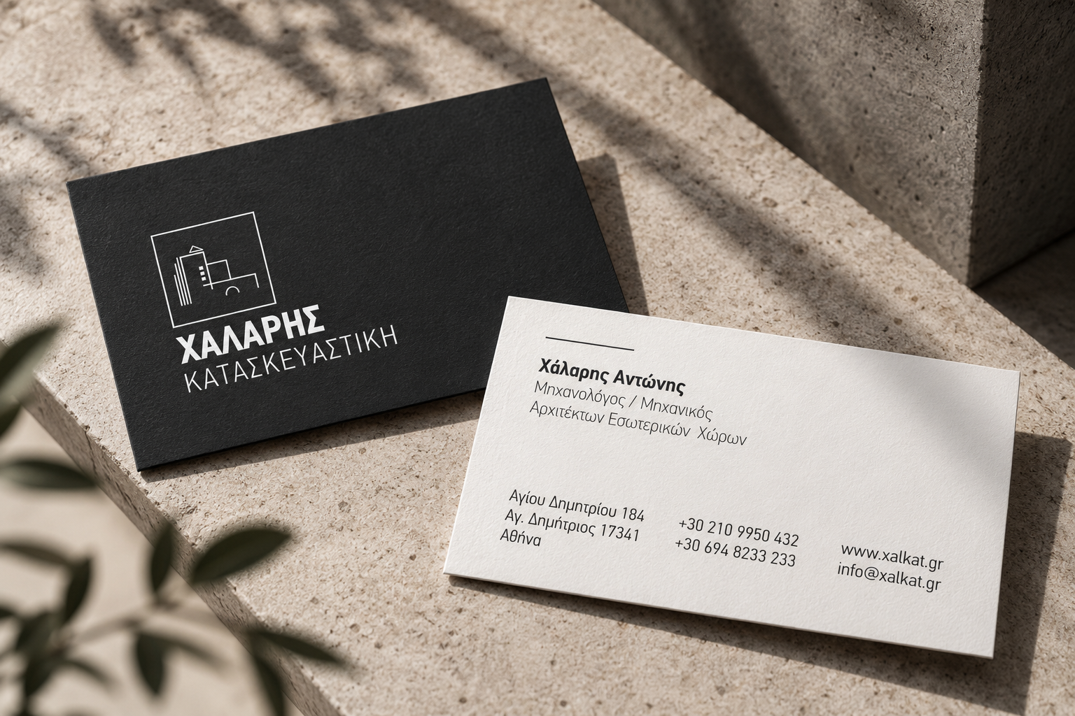
The logo kept the same logic as a mark. The changes we chose to make were to the colour and the layout of the logo. After many years in construction and renovation, the company has earned a standing. Choosing black helped us express that recognition and, at the same time, gave it a modern design note.
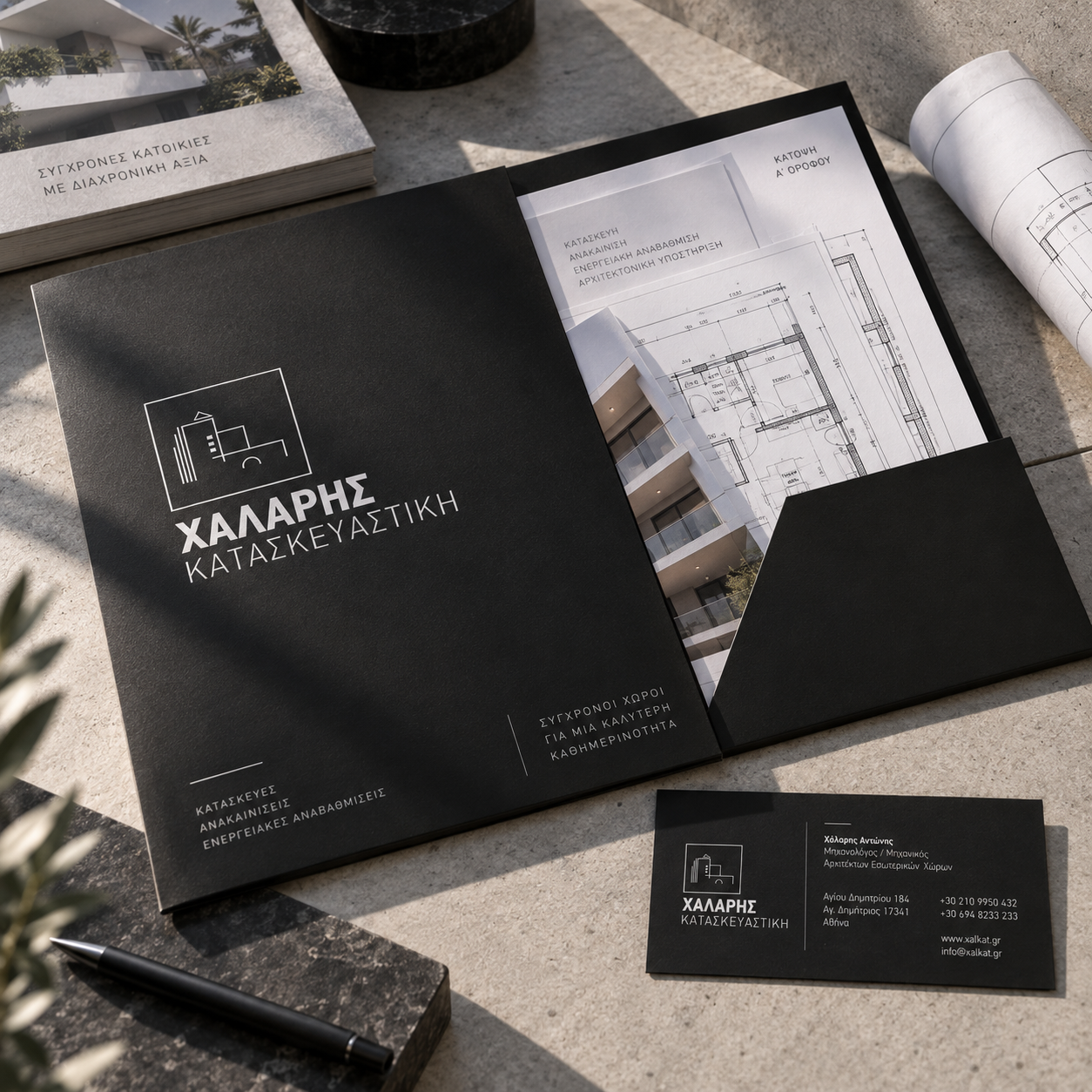
The typography was simplified and replaced with contemporary typefaces in different weights. The clean design and the single-colour typography across the corporate identity let the logo stand out.
How it came together
- 01
Research & challenge
For a construction company the image doesn't live only on cards and stationery. It lives on the work itself: on the banners that dress buildings while they go up, on the site signs, on the website where someone looks for a flat or a shop. The new identity had to hold at all these scales and convey what the client is really buying: reassurance, precision and technical competence.
- 02
Idea & design
The mark is built from clean geometric shapes that together form a house — the most direct image of what the company produces. Beneath it, the name Chalaris Construction sits in a plain sans, with no serifs or ornament, so the whole reads with the clarity of a good construction drawing. For the online presence we used the short name Chalkat, from the initials of the Greek name (ΧΑΛάρης ΚΑΤασκευαστική). The palette is limited to black, white and grey. We completed the identity with the motto "From concept to creation", which sums up the journey of every project from study to handover.
- 03
Delivery & result
We applied the identity to signs, print and the large banners that cover buildings during construction, so that every site also works as a showcase. We built the company's website, chalkat.gr, in WordPress on a premium theme adapted to its needs: structure, typography and the presentation of projects follow the identity, not the other way round. We support its operation and the company email on an ongoing basis, and for a period we also handled social media. The result is a single presence: anyone who sees the banner in the street finds the same image when they open the website.