

Branding for Hotels & Accommodation
Short answer: Branding for hotels and accommodation means designing an identity that conveys the experience of the stay before the guest even arrives: logo, colours, typography, photographic style and applications in signage, room stationery, website and social media.

Short answer: Branding for hotels and accommodation means designing an identity that conveys the experience of the stay before the guest even arrives: logo, colours, typography, photographic style and applications in signage, room stationery, website and social media. Poua Design designs identities for hotels, boutique hotels, guesthouses and rental accommodation across Greece, with an emphasis on consistency from the first online search to check-out.
Why accommodation needs branding, not just a logo
A hotel guest “buys” something they can’t see or touch before arriving. They decide on the basis of photographs, reviews and the overall feeling the accommodation leaves across Booking, Airbnb, Instagram and its website. If those touchpoints don’t “speak” the same language, trust is lost and the room rate looks higher than it is.
Branding solves exactly that: it defines what the accommodation is, who it’s for and how it wants to be remembered. The logo is only the signature. The identity is how that signature appears on the entrance sign, the key card, the breakfast menu, the confirmation email and the first post after the renovation. If you’d like to see what a complete identity includes, read our guide to branding and corporate identity.

What branding for a hotel or accommodation includes
Strategy and positioning
Before designing anything we answer three questions: who the ideal guest is (couples, families, remote workers, groups), what makes the accommodation different (location, architecture, history, philosophy of hospitality) and which price category it wants to be placed in. The answers set the tone of the identity: a minimal boutique hotel on an island can’t have the same visual language as a family resort or a traditional mountain guesthouse.
Logo and mark system
For accommodation we usually design a primary logo and two or three variations: horizontal, vertical and a monogram or symbol that works on its own on small surfaces such as the favicon, the key card, the label on the soap or the embroidery on a towel. The mark must read on a large sign as well as on an Instagram profile picture. More on the process in our article on logo design.
Colour palette and typography
In hospitality, colours work with the architecture and the natural landscape. In a white Cycladic property the palette can be almost colourless with one warm tone, while in a stone guesthouse earthy tones and deep greens blend with the setting. Typography defines character: a serif gives discreet luxury, a clean sans-serif gives contemporary calm. Each choice is recorded in Pantone, CMYK, RGB and HEX, so the sign, the printed piece and the website are exactly the same colour.
Photographic style and tone of voice
In hotels, photography is half of the branding. We set direction for shoots (natural light, scenes of staying rather than empty rooms, material details) and for the tone of copy, from an Instagram caption to the welcome note in the room. That way, whoever handles social media or the website, the result stays consistent.
Applications that make a difference to the guest experience
An accommodation’s identity lives on dozens of small surfaces. The most common applications we take on are:
- Signage: entrance sign, room numbers, directional signs, “do not disturb” cards. We choose materials (wood, metal, plexiglass, engraved stone) that stand up to salt air or humidity and suit the architecture.
- Room stationery: welcome card, services directory, breakfast menu, a local map with recommendations, Wi-Fi card. They’re the first things a guest picks up and they often end up in a photo on social media.
- Amenities and packaging: labels on soaps and toiletries, packaging for local products offered as gifts, bags and boxes. See how we approach packaging design.
- Business cards and letterheads: for management, for offers to partners and for communication with tour operators.
- Digital applications: a website with a booking system, Instagram and Facebook templates, an email signature, artwork for Booking and Airbnb. More in the article on digital design and social media.

Case study: Aneraides, Kythnos
Aneraides Apartments are rental apartments on Kythnos, in the Cyclades. The name comes from a local legend tied to the owning family, so the brief was to turn a living story into a mark of hospitality: recognisable, airy and simple enough to work on a sign, on keys and in every small application of the accommodation.
We drew a single-colour aneraida floating between moon and stars, with the headscarf from the legend as the key to the story, in a soft dusk purple, and set the name in Futura. The identity then moved into the points a guest meets from arrival to departure: the accommodation’s sign, the “do not disturb” card for the doors and key holders with numbered keyrings, plus embroidered towels. The logo later won the bronze medal at The Best Brand Awards, an international logo competition.
The lesson applies to any accommodation: branding doesn’t have to shout. It has to be consistent with what the guest will actually live. Read the full story in the Aneraides project.
Case study: The White House, Kalami, Corfu
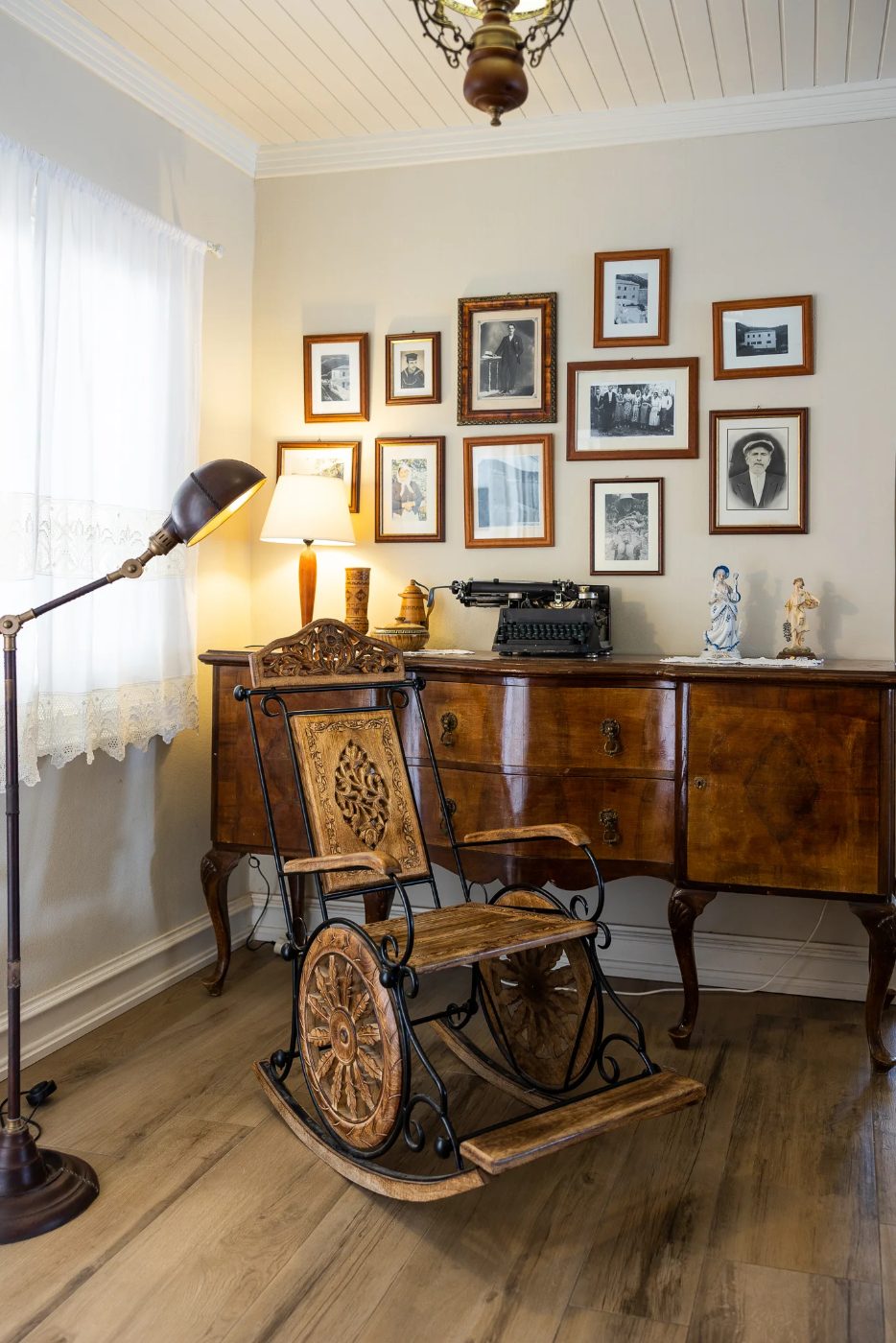
On Kalami Bay, in the north-east of Corfu, a white house stands right at the water’s edge. It is the historic home of the Durrell family, where Lawrence Durrell lived, and it is called The White House. The company that runs it decided to bring the whole area around it back to life, with apartments gathered around the villa, and trusted us with the part that matters most: making the entire business speak with one voice.
A mark in the shape of the house
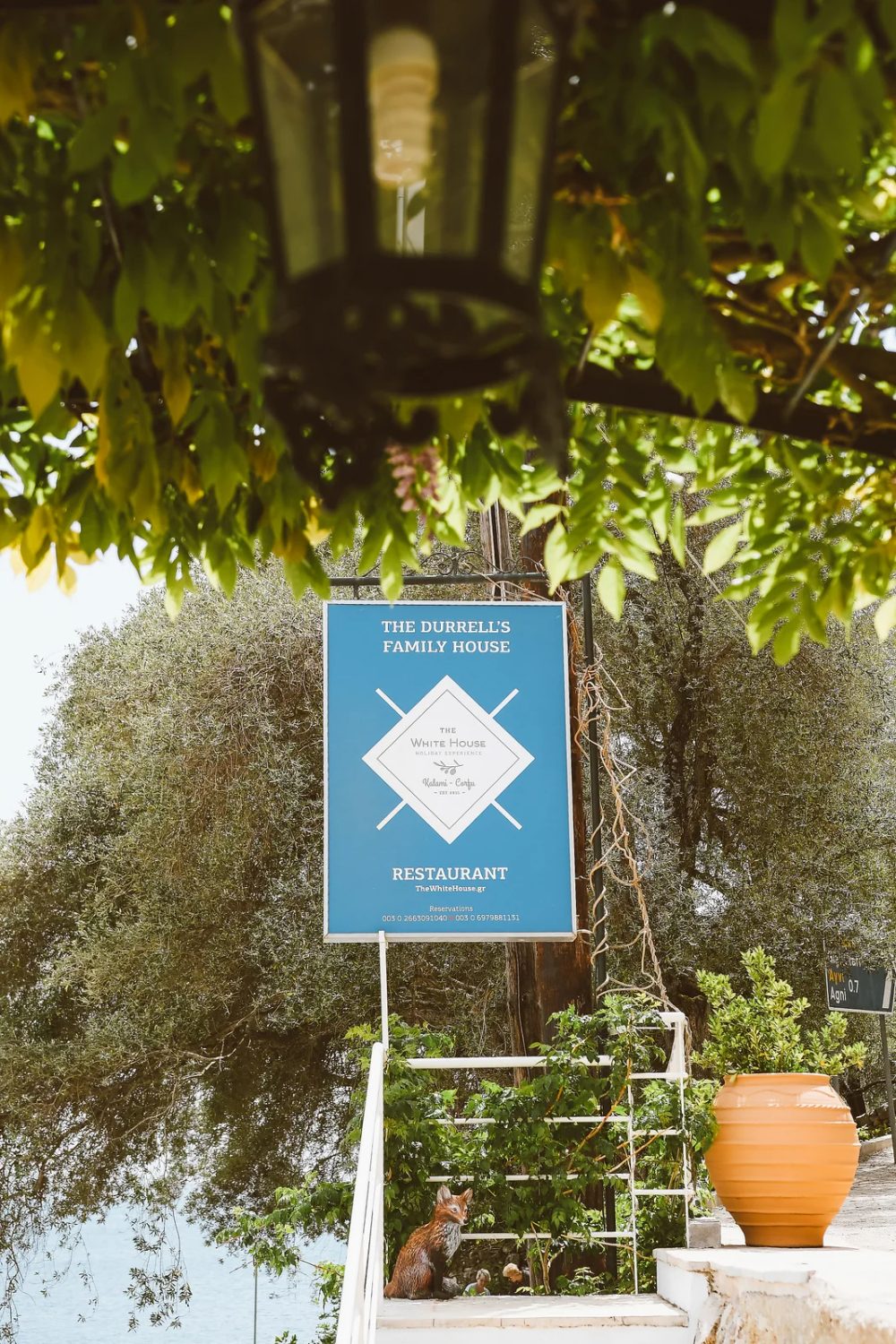
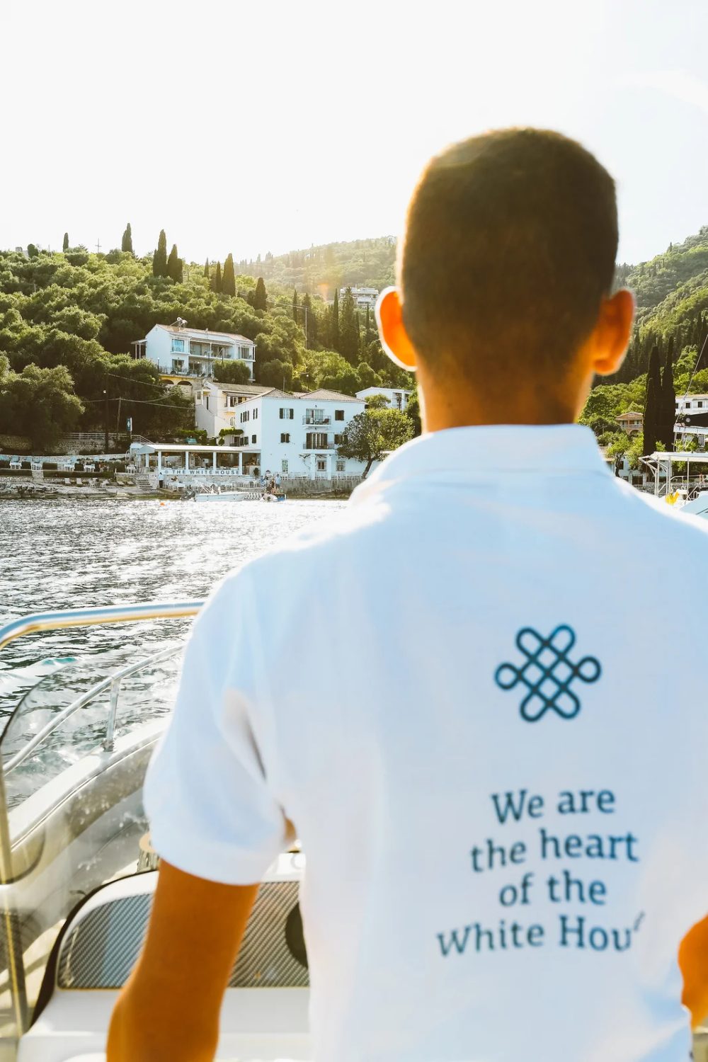
The logo starts from the building itself. It is a square: the floor plan of the house, with its corners, because this house does not look at the sea from a distance. It stands on it. The colour came from the same place, a deep sea blue with white and grey. The mark needed no further story. It is recognised at a glance, simple enough for a sign, a card and a staff uniform, and strong enough to carry the history of the place without raising its voice.
One identity for the whole estate
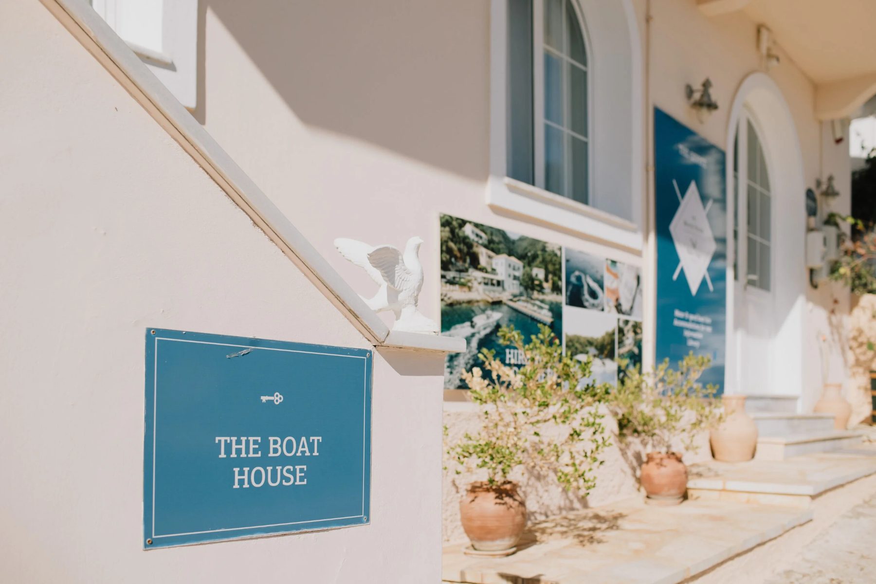
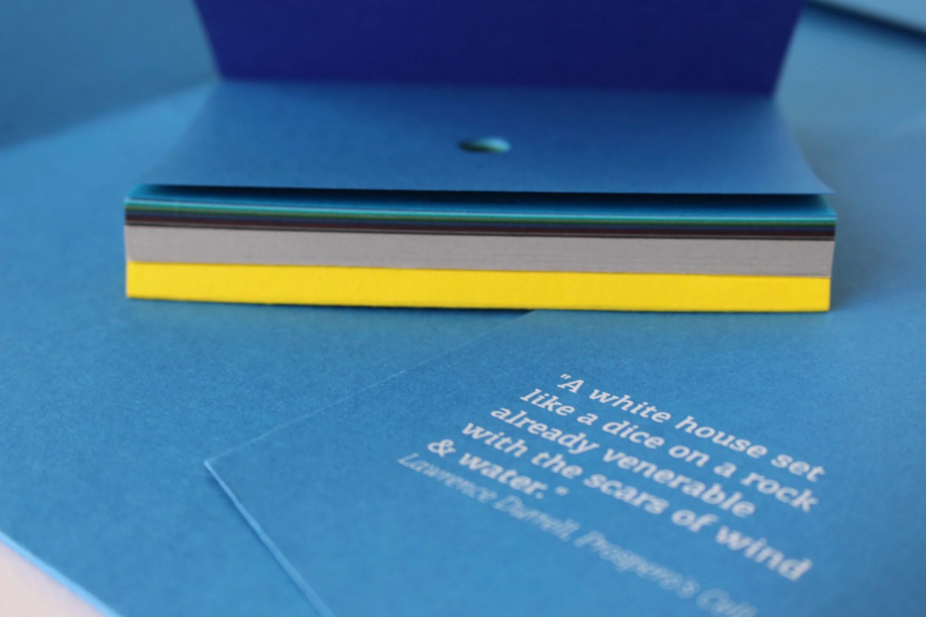
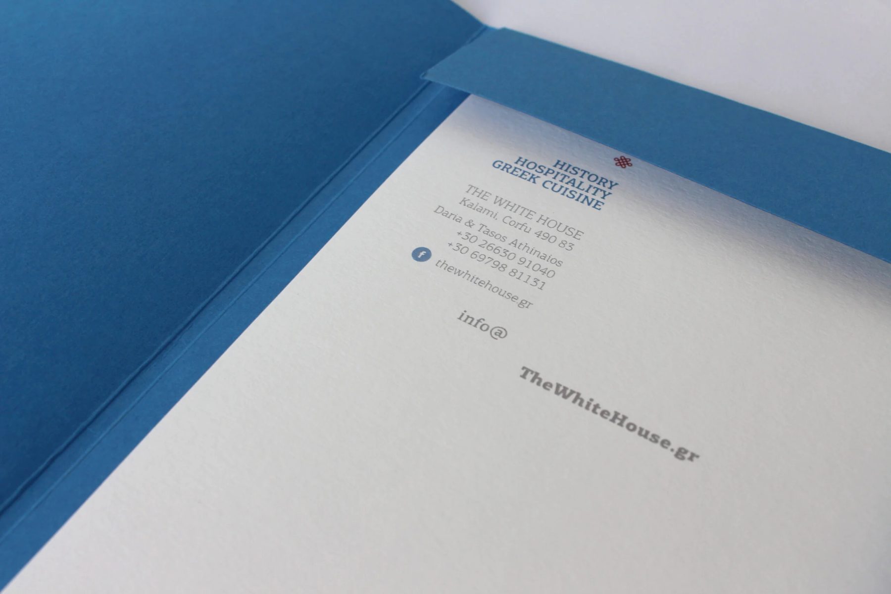
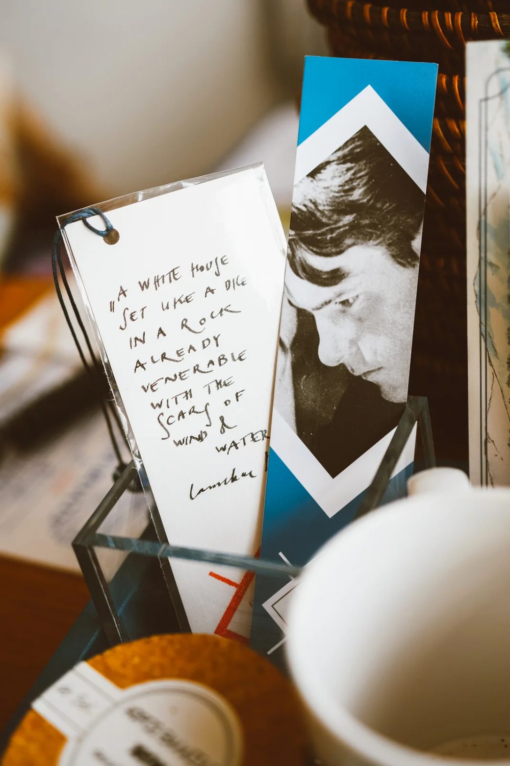
We designed the complete corporate presence of the business: for the apartments, for the restaurant and for everything connected to the Durrell story. Print and digital material, signage across the property, the look of the people who work there and, for a period, its social media. The business cards carry a line by Lawrence Durrell about the house, because in a place with this history the words belong to the identity as much as the symbol does.
The result
Everything a guest meets, from the sign among the olive trees to the staff uniform and the bookmark in a printed note, belongs to the same world. That is what a property with a history needs: one image that does not change from place to place, and that reminds the guest where they are. See The White House at thewhitehouse.gr.
How we work with hotels and accommodation
1. Briefing and research
We discuss the property, the location, the guests and the rates. We study the competition in the area and the booking platforms, so the new identity stands out in search results and not only on paper.
2. Concept and directions
We present two or three design directions with a moodboard, logo proposal, palette and typography, applied to real surfaces (sign, card, Instagram) to show how the identity works in practice.
3. Development and applications
We develop the chosen direction, design the applications and prepare the files for each use. For signage and print we also supervise production, so colour and material come out as designed.
4. Brand guidelines and handover
We deliver a short manual with the rules for using the logo, colours, typefaces and application examples, so the accommodation’s team or an outside social media partner can work consistently without asking us each time.
When is the right time for branding or rebranding
The most common triggers are the opening of a new accommodation, a renovation or upgrade in category, a change of audience (for instance from family to adults-only), a move from platforms to direct bookings through a website, and the feeling that the photographs, logo and prices “don’t fit together”. Ideally branding is finished before the photo shoot and before the season, so the new material goes live on all platforms at once.
Frequently asked questions
How much does branding for a hotel or accommodation cost?
It depends on the scope. A small property with a logo, basic palette and a few applications costs differently from a hotel with full signage, room stationery, amenity packaging and a website. After the first briefing we send a detailed quote without commitment.
How long does it take?
A complete branding project for an accommodation usually takes 4–8 weeks. If it includes signage and print, allow extra time for production. We recommend starting at least three months before the season.
Can branding be done for rental rooms or Airbnb?
Yes, and it often makes a big difference to performance. A small property with a consistent identity, a nice welcome card and a polished profile stands out on the platforms and justifies a better rate. The package is adapted to the size of the business.
Do you also handle signage or the website?
Yes. We design signage and supervise its manufacture, and build WordPress websites with a booking system, so the identity is applied from the sign to online booking.
What do I receive at the end?
Logo files in all variations (AI, PDF, SVG, PNG), print-ready or web-ready application files, colour specifications, typefaces and the identity’s usage guidelines.
Let’s talk about your accommodation
Whether you’re opening a new hotel or refreshing the image of an existing property, send us a few words about the space, the location and your guests. We’ll reply with questions, ideas and a first estimate. Contact Poua Design or see all our services.
Founder, graphic designer & creative director of Poua Design. She has been designing identities, packaging and print in Athens for 15+ years.
WHO WE ARE →