

Business Cards: A Guide to Choosing Paper & Finish
Short answer: The right business card comes from combining three decisions: the paper (type and weight, usually 300–600 gsm), the finish (letterpress, foil stamping, embossing, soft-touch lamination, spot UV) and correct preparation of the print file.
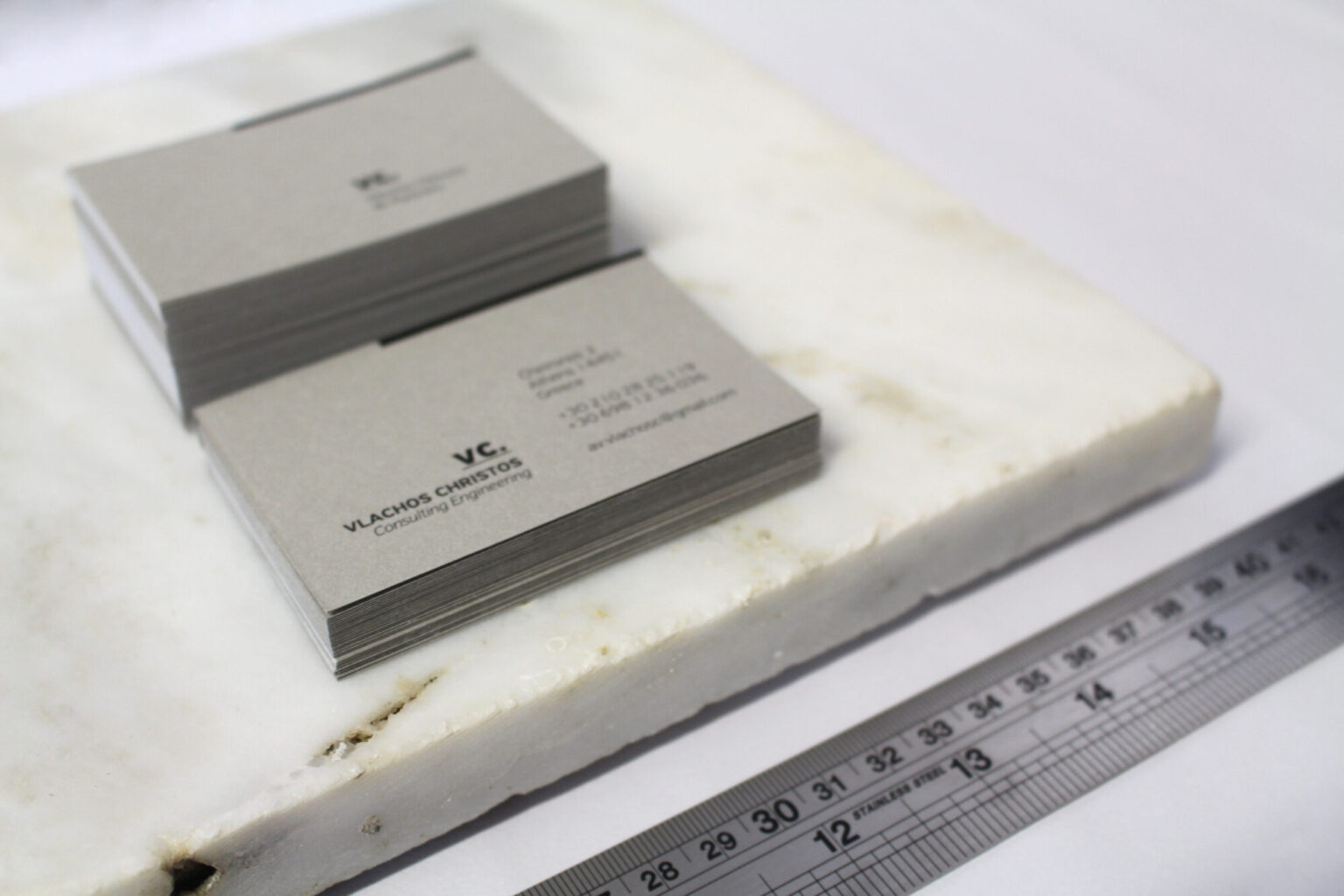
Short answer: The right business card comes from combining three decisions: the paper (type and weight, usually 300–600 gsm), the finish (letterpress, foil stamping, embossing, soft-touch lamination, spot UV) and correct preparation of the print file. At Poua Design we design and supervise the production of business cards in Athens, choosing materials that suit each brand’s identity rather than simply the cheapest paper available.

Why the business card still matters
In an age when everything is shared digitally, the business card is one of the few touchpoints with your brand that someone holds, literally, in their hand. The weight of the paper, its texture, the way light catches an embossed logo — all of it says how seriously you take your work, before your name has even been read.
A card on thin, glossy paper from mass online printing and a 600 gsm card with a coloured core and letterpress cost differently, but they also say completely different things. The decision isn’t only aesthetic; it’s strategic, and tied directly to the business’s overall corporate identity.
Paper: type, weight, texture
Weight (grams)
Weight is measured in grams per square metre (gsm) and is the first thing people notice. Roughly:
- 250–300 gsm — the basic, economical standard. Functional, but with no particular feel.
- 350–400 gsm — the balance point for most businesses. A sturdy card that doesn’t crumple in a pocket.
- 450–600 gsm — a premium feel, usually made by laminating two sheets together (duplex/triplex). Ideal for studios, architecture practices, high-positioned brands.
- 600+ gsm — special constructions, mainly for letterpress, where impression depth needs thickness.
Paper types
Coated / velvet: smooth, coated paper with clean colour reproduction. The safe choice when the design has photographs or strong colours.
Offset / uncoated: matte, slightly porous, with a natural texture. Colours sit more muted, but the feel is much warmer, and it’s easy to write on with a pen.
Cotton papers: no wood pulp, exceptionally soft, almost fabric-like. The first choice for letterpress and for brands that want a handmade character.
Recycled and natural papers: with visible fibres and irregularities. They suit brands with an environmental or traditional narrative — and it isn’t merely an “eco statement” but an aesthetic choice.
Coloured core and duplex
The “core” is the inner layer of the paper visible at the edge. By laminating two or three sheets, we can place a coloured sheet in the middle so the card has a fine coloured line around its edge. Alternatively the edge can be painted (edge painting) or gilded. It’s one of the most discreet and most striking details a card can have.
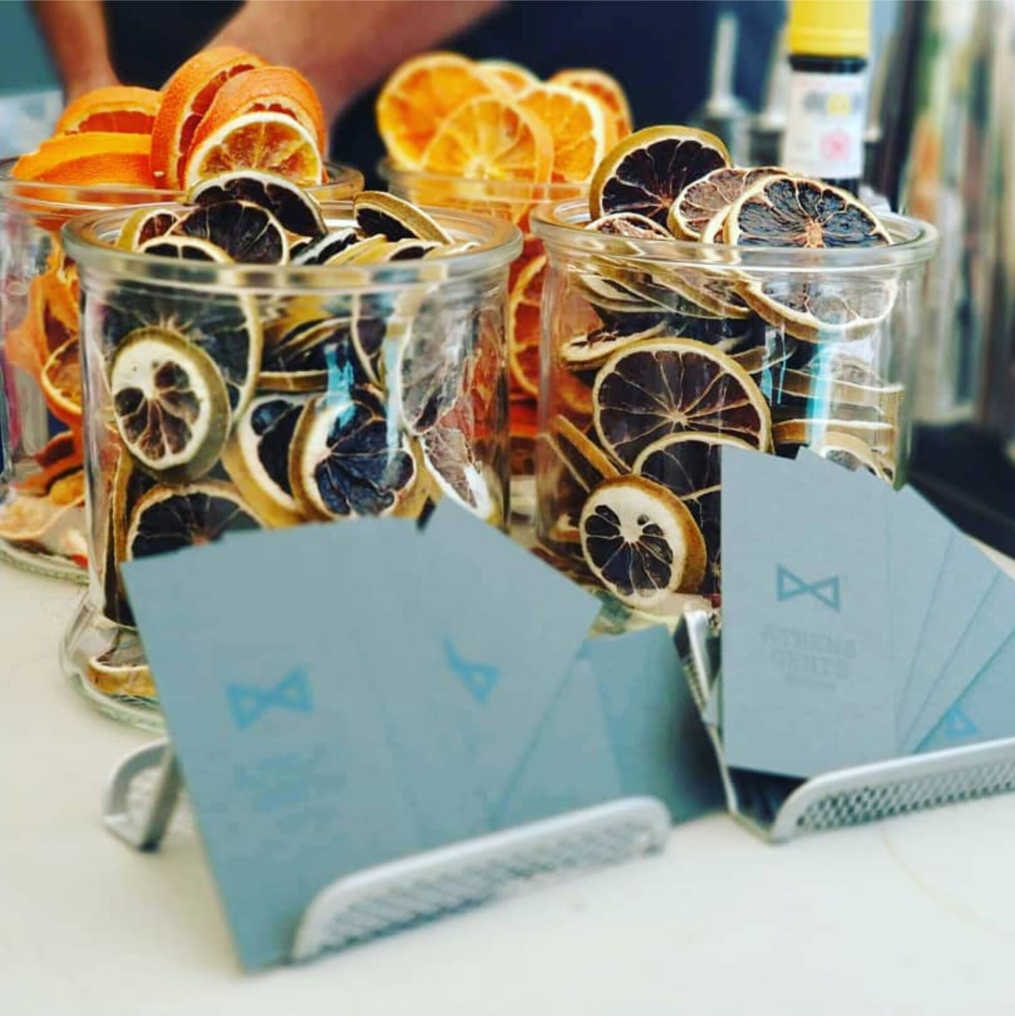
Finishes: what each does and when we choose it
Letterpress
The oldest technique: the type is pressed into the paper and leaves a debossed impression. It needs thick, soft paper (preferably cotton, 500+ gsm) and works best with simple designs, linear logos and few colours. It’s not suited to photographs or very fine detail. Cost is higher because a plate must be made for each colour.
Hot foil stamping
Metallic foil (gold, silver, copper, but also matte coloured or holographic) is transferred with heat and pressure. It gives a shine no CMYK print can reproduce. Excellent on dark or uncoated papers, where normal ink would fade. It needs a metal die, so it makes sense from certain quantities upward.
Embossing / debossing
The design is raised (emboss) or sunk (deboss) without ink. “Blind emboss” — relief without colour — is one of the most elegant solutions for single-colour cards, because the logo is read only through light and shadow.
Lamination: matte, gloss, soft touch
Matte lamination protects the card and gives a discreet, contemporary feel. Gloss intensifies colours but shows fingerprints and makes it hard to write on the card. Soft touch (velvet) is the most expensive of the three and gives a suede-like texture — it works strikingly on dark cards.
Spot UV
Gloss varnish on selected areas over a matte surface. The classic example: a matte-laminated card with the logo in glossy UV. Understated, cheaper than foil, and very effective when used with restraint.
Cutting, rounded corners and special shapes
Rounded corners change a card’s character at once and protect it from wear. Special shapes or perforated designs need a cutting die — a one-off cost worth paying when the shape genuinely connects to the identity and isn’t just for effect.

Dimensions and technical specifications
In Greece the most common size is 85 × 55 mm, while internationally you also find 90 × 50 mm or 89 × 51 mm (US). For the card to reach the printer correctly you need:
- Bleed of 3 mm on every side, if colour or an image runs to the edge.
- Safe margin of 4–5 mm inside the final trim for text and logos.
- Resolution of 300 dpi for all images at final size.
- Colour profile CMYK or defined Pantone colours, if the brand has fixed corporate tones.
- Fonts converted to outlines and a production-ready PDF/X.
These details are why print production and print supervision aren’t a secondary stage: a wrong colour profile or an unexpected paper texture can alter the colour of your logo across an entire run.
How we choose by sector
Law and accounting firms: uncoated or coated paper at 350–400 gsm, typographic restraint, perhaps a blind emboss on the monogram. Here, reliability translates into restraint.
Beauty and wellness salons: soft-touch lamination, gentle tones, possibly matte foil. See also our guide to branding for beauty and wellness spaces and the cards we designed for Momar Beauty Hall.
Restaurants and delivery: durable paper with matte lamination, because the cards pass through many hands. Here function (a legible phone number, a QR code) beats luxury.
Creative professions and studios: cotton paper, letterpress or a coloured core. The card acts as a sample of your aesthetic judgement — and is often part of your portfolio.

Five mistakes that cost you
- Too much information. Two phone numbers, three emails, four social accounts and a slogan don’t fit in 85 × 55 mm. Keep one phone, one email, one website.
- Type too small. Below 7 pt, text becomes illegible, especially on porous papers where ink spreads.
- A finish for no reason. Three different effects on one card cancel each other out. One well-chosen finish is enough.
- Choosing paper without a sample. A paper on screen and in the hand are two different things. We always ask for a swatch book before ordering.
- A card cut off from the rest of the brand. If the card doesn’t speak the same language as the logo design, the website and the packaging, coherence is lost.
How we work at Poua Design
We don’t start from the finish but from the brand. First we define what the card should convey, then choose paper and technique to serve it, and finally adapt the design to the real constraints of production. With more than fifteen years as designers in Athens, we work with printers we know and personally supervise printing when the project requires it.
The process includes: a brief and understanding of the sector; design proposals on realistic mockups; paper selection with a physical sample in hand; technical file checks; and coordination with the printer through to delivery. When the card is part of a wider package — letterheads, envelopes, leaflets, packaging — everything is designed as one system.
Frequently asked questions
How much do business cards cost?
Cost depends on three factors: design, quantity and materials. A simple 350 gsm card with matte lamination in 500 copies is considerably cheaper than a 600 gsm card with letterpress and foil, where die costs are added. Ask for a quote describing what you want the card to convey and we’ll suggest the best combination for your budget.
What paper weight is best for a business card?
For most businesses 350–400 gsm is the balance point between cost and a quality feel. Below 300 gsm a card feels flimsy, while above 450 gsm you’re in the premium category with matching cost. Letterpress needs at least 500 gsm so there’s depth of impression.
What’s the difference between letterpress and foil stamping?
Letterpress is pressure: the design is pressed into the paper, usually with ink, creating a tactile relief. Foil stamping transfers metallic foil with heat and gives a shiny, metallic result. The two can be combined, but both need a die and thick paper.
How many cards should I print?
Most techniques become cost-effective from 500 copies up, especially those needing a die. But if you expect a change of details or a rebrand within the next year, a smaller run makes more sense than leaving a thousand useless cards in a drawer.
Can you handle the printing as well?
Yes. We take on the design, file preparation, choice of paper and finish, and work with and supervise the printer, so the final result matches what was approved.
Do I need a QR code on my card?
It makes sense when it leads somewhere specific and useful — a product catalogue, a booking page, a digital contact card. It makes no sense as a decorative element, or when it leads simply to the home page of a website that’s already printed on the card.
Start designing your cards
If you want cards that really show what you do and how you do it, send us a short description of your brand. We’ll suggest paper, finish and a design direction based on your sector and budget.
Founder, graphic designer & creative director of Poua Design. She has been designing identities, packaging and print in Athens for 15+ years.
WHO WE ARE →