Two experienced bartenders were launching their own bar services company.
A mark you read twice: as a gentleman's bow tie and as a jigger, the bartender's measure.
An identity that sets up and packs down together with the bar, and is recognisable from across the room.
Athens Gents — brand identity for bar services & events
Athens Gents provides bar services and bartending for weddings, parties and corporate events in Athens. It came to us as a new venture by two professionals of the trade, with the name already decided and nothing yet designed.
I like marks that hide something of the profession they serve. Here the bow tie wasn't added as decoration; it was already inside the bartender's tool, and it only needed to be seen from the right angle. When a logo comes about this way it doesn't need explaining — people in the trade recognise it, and everyone else remembers it.
How it came together
- 01
Research & challenge
The name was their own idea and it already made sense: "Gents" for the style and look of the team, "Athens" for the city where most of the events happen. What remained was to give it a form. A mobile bar has no shop window and no façade: its identity travels in a car, goes up in a few hours, works in low light and is judged from a distance. Whatever we designed had to hold up under those conditions.
- 02
Idea & design
We started from the tool of the trade. The jigger, the measure used to portion drinks, is made of two cones joined at the middle; turned on its side, it becomes a bow tie. That double reading became the mark, placed beneath the wordmark. The typography is thin and squared-off, with a hint of digital retro, so its corners lock in with the corners of the jigger. Before settling, we tested other versions of the bow tie without the link to the measure, purely typographic solutions and a more hand-drawn approach with a shaker. The palette comes from the dress code the name implies: black and a deep, intense blue, the two colours of a tuxedo.
- 03
Delivery & result
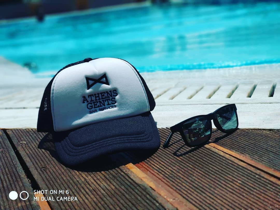
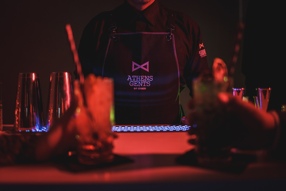
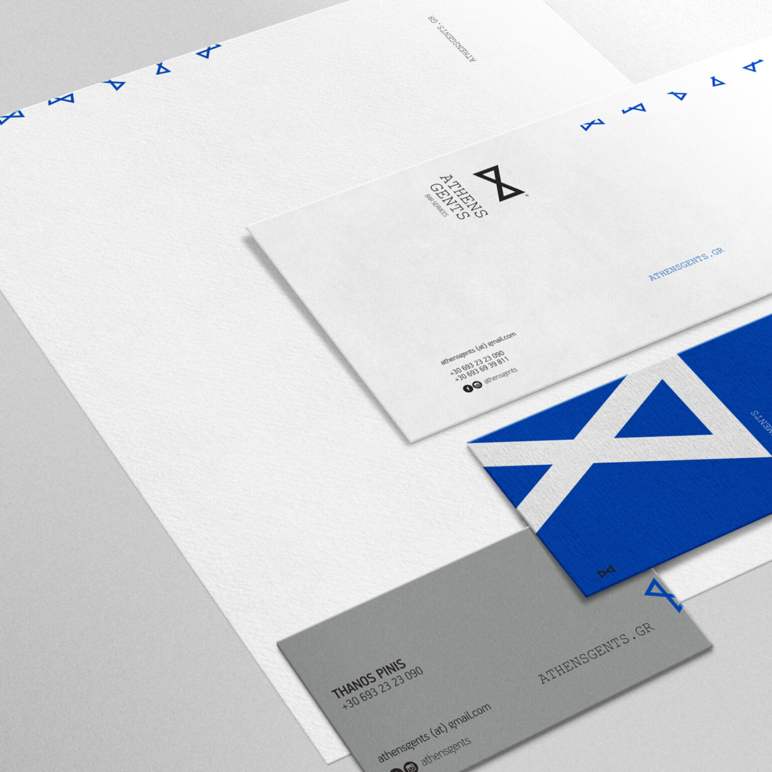
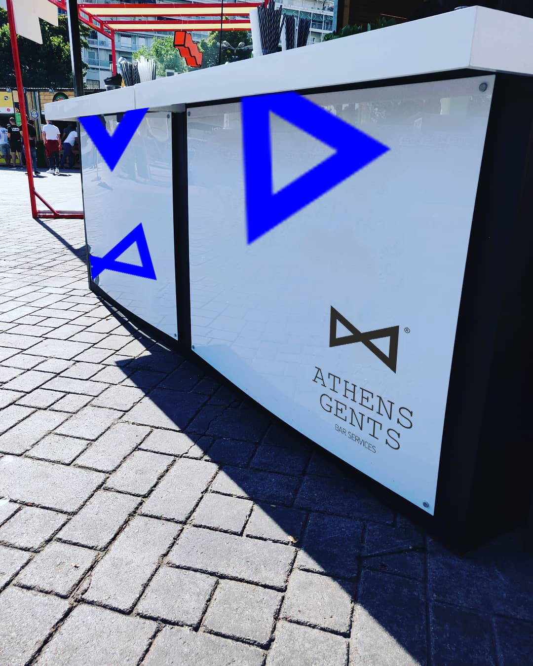
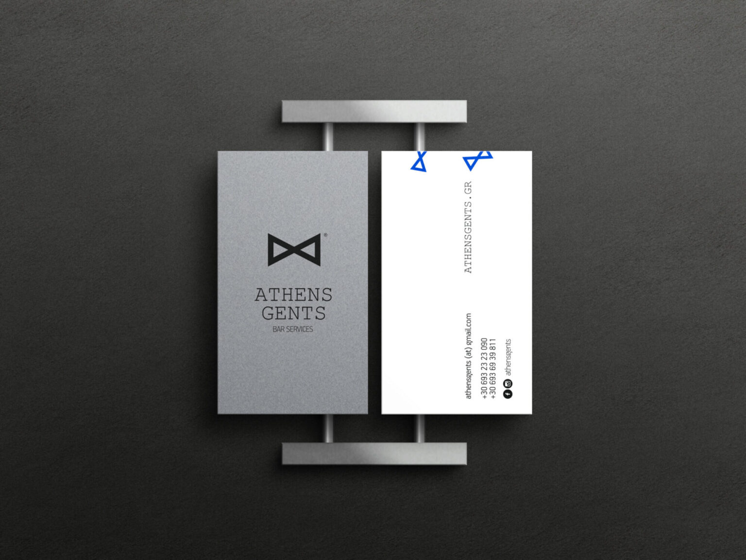
The identity went into every place where the team appears: the mobile bar's cladding, staff aprons, caps with the logo embroidered, a banner beside the bar and signage on the vehicles that carry the equipment. The business cards are made of two laminated sheets of paper and screen-printed, so they have weight and the mark can be felt as well as seen. Our collaboration covered creating the identity and its applications — day-to-day social media communication stayed with the team. What we delivered was a system that works at every event without needing to be redesigned each time.