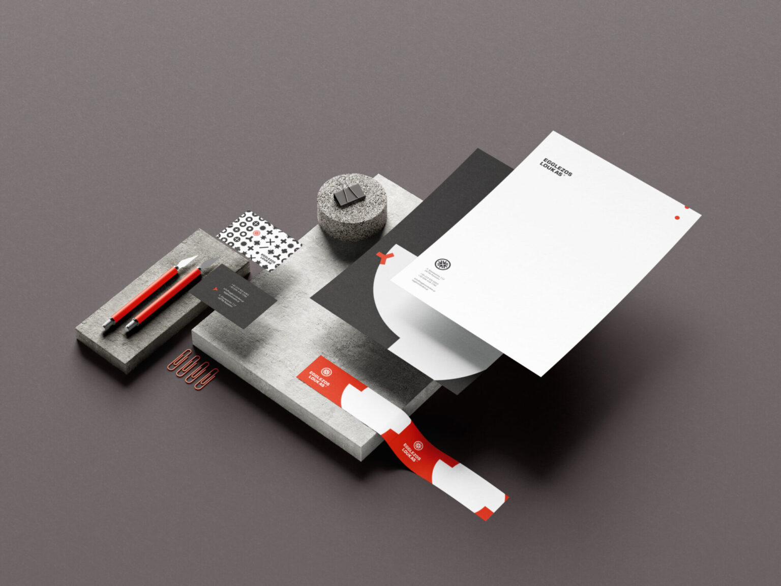
A business with two decades of loyal customers that had no image: no logo, no sign, no digital presence.
We kept the name and built an industrial visual language around it, starting from the product itself: the screw head.
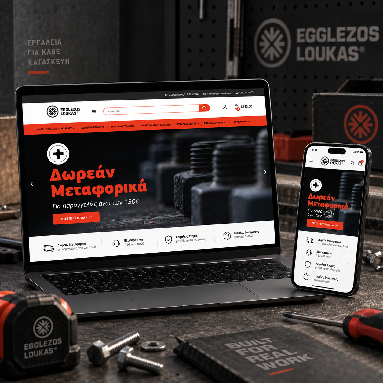
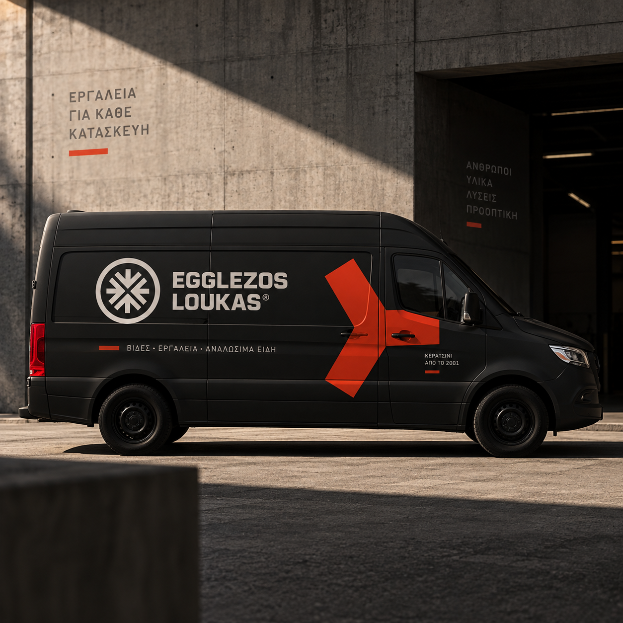
One unified brand that runs from the sign and the uniform to the invoice and the e-shop, in a collaboration that continues.
Rebranding & E-commerce
The Egglezos Loukas store supplies screws, tools and industrial consumables to machine shops, garages and professionals in Keratsini. When the company approached us in 2023, it already had two decades of customers and daily footfall — and no image to show for it.
We weren't looking at a new business, but at a store its customers have known since 2001. In projects like this the risk isn't falling behind; it's accidentally erasing what brought you this far. That's why we didn't change what the company is, only how it looks.
How it came together
- 01
Research & challenge
The shop window was covered in sun-faded stickers, with no logo and no proper sign. The space wasn't organised and prices were marked by improvised means. Digitally, the only presence was a static Flash site, with no social media and no online shop. The challenge wasn't to show something new, but to make visible what was already there: two decades of experience, speed and trust.
- 02
Idea & design
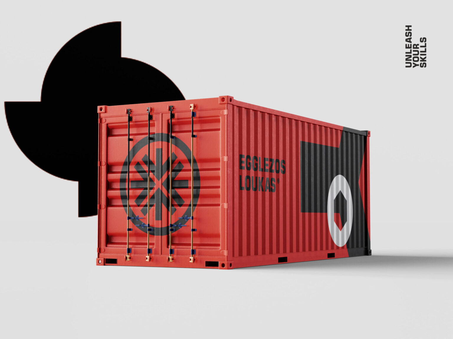
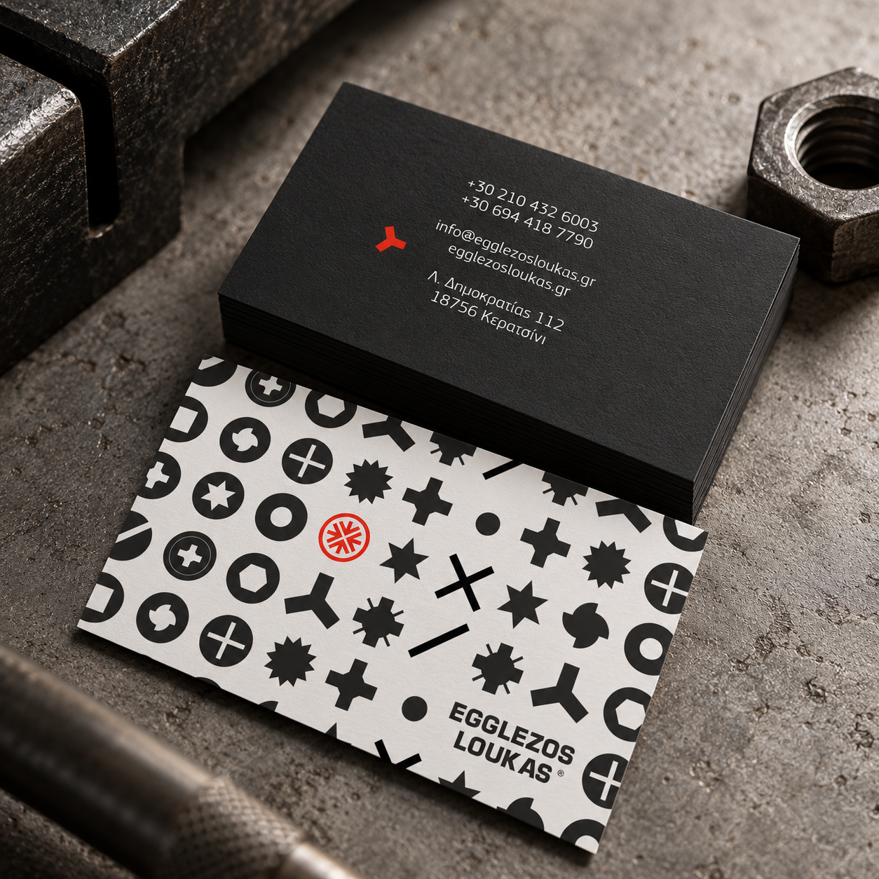
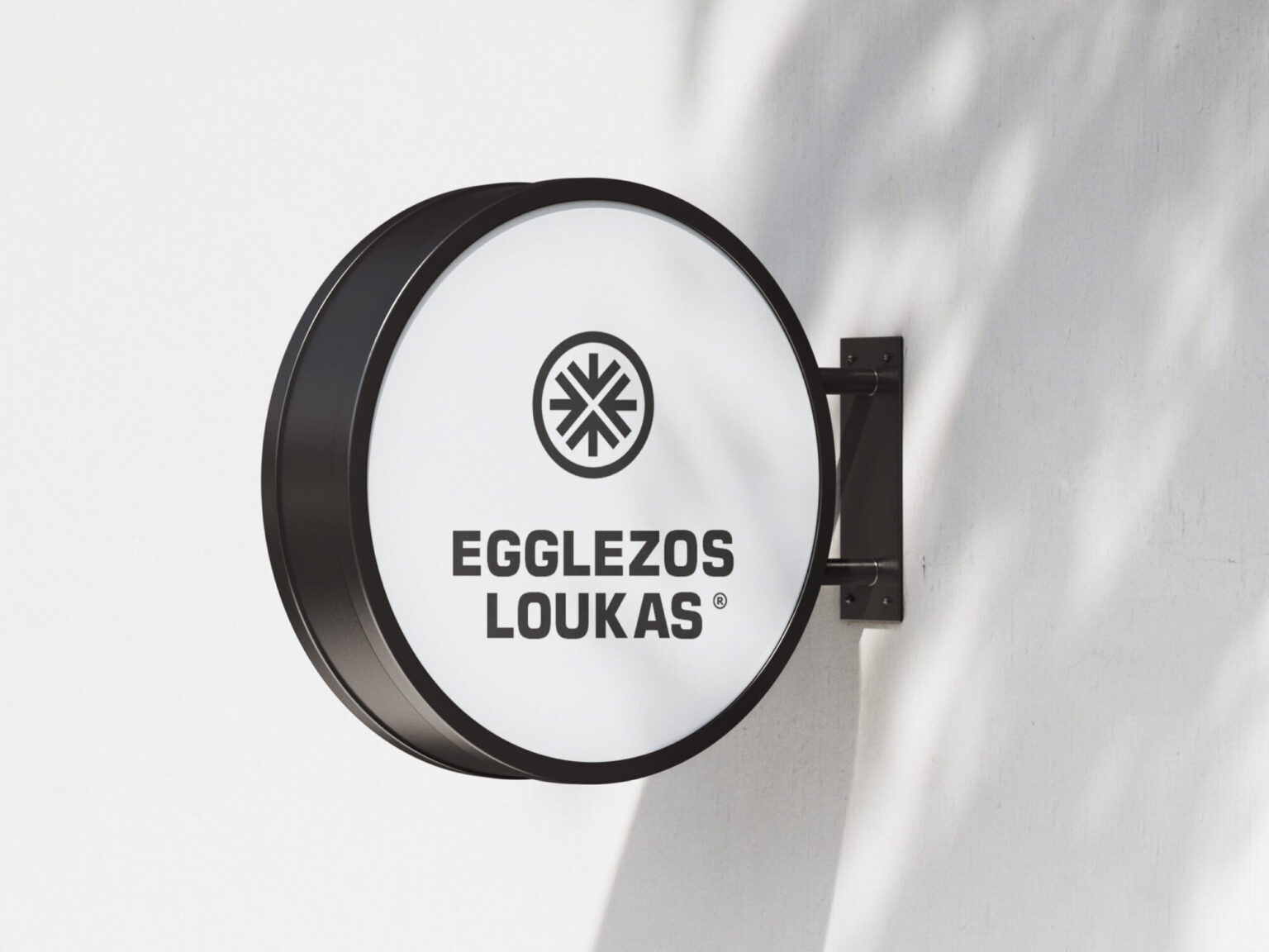
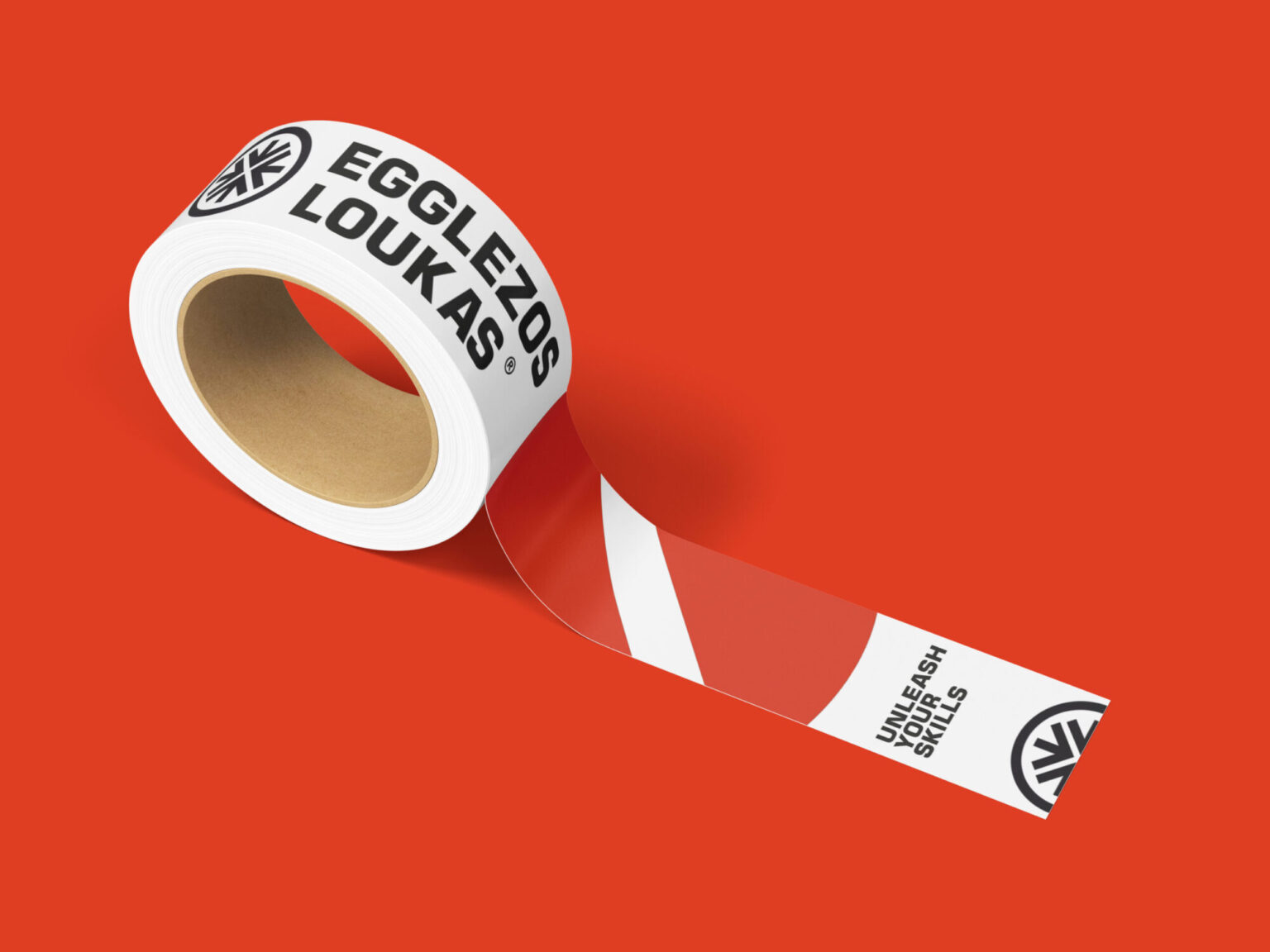
The name stayed untouched, because all the recognition was stored there. We designed a symbol that looks like a screw head without copying any real one: its slots form the "E" of Egglezos and, at the same time, directional arrows. Beside it, PF Square Sans Pro in a heavy weight gives the industrial weight and the years behind the name. The palette came from the machine shop itself — white, black, grey, silver — with Pantone 179C as the single note of intensity. From the logo grew an entire system: screw heads drawn in plan view, purely linear, working as pattern, icons and texture in every application.
- 03
Delivery & result
The application began on the street: new signage and window graphics across all the shop windows, and a large LED screen at the entrance showing products and video — a landmark that now lights up the whole neighbourhood. Packaging followed, with boxes specially built to bear the weight of the materials, then business cards, shelf price labelling, staff clothing and corporate stationery. We designed and supervised the shop's renovation from start to finish. Today the collaboration continues on the digital side: e-shop, social media, campaigns and every new print job pass through the same system. From the invoice to the offer banner, the company now speaks with one voice.