A name well established in traditional costume, passing to the second generation and needing an image worthy of its reputation.
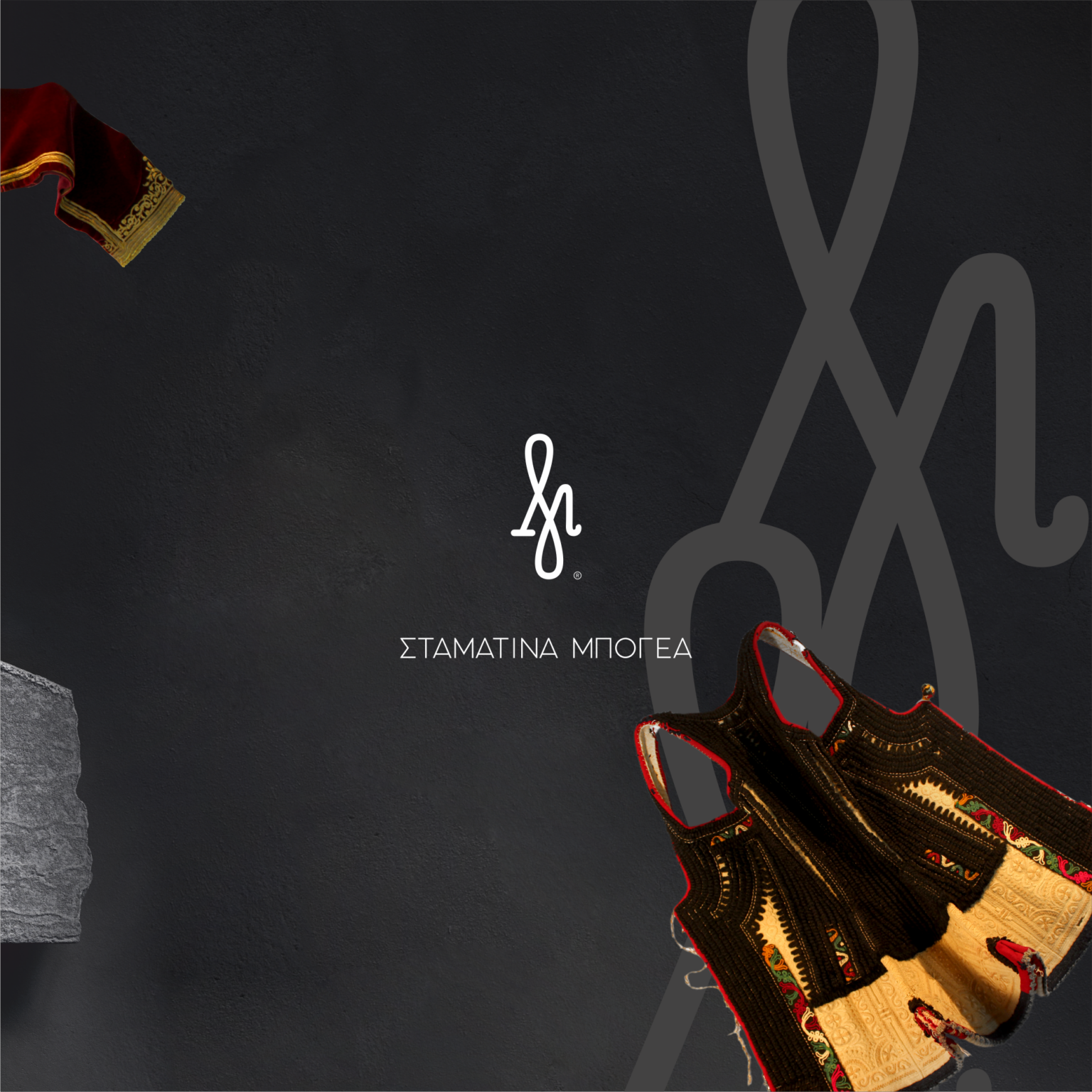
A monogram from the "M" of Bogea, drawn like a motif that could have been lifted from a costume.
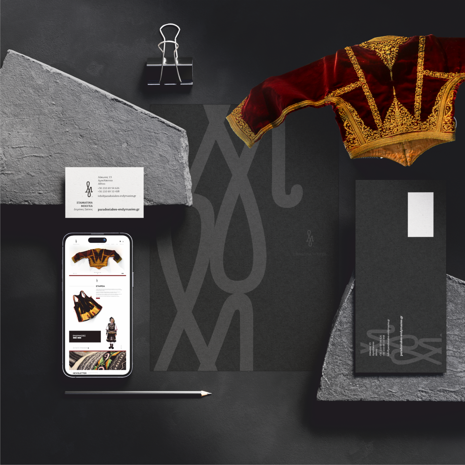
A black-and-white identity with gold details, applied to print, digital media and a website.
Stamatina Bogea — Traditional Costumes
The Stamatina Bogea business sews, rents and custom-makes Greek traditional costumes, for individuals as well as cultural and dance associations. It was founded by the father of the family and is now carried on by the three siblings, who asked for a complete rebranding.
What we wanted wasn't simply to "dress" this story in a new logo, but to give it a contemporary identity without losing any of its authenticity. That's how the monogram came about — something between a signature and an embroidery — and the brand's whole visual language was built on it.
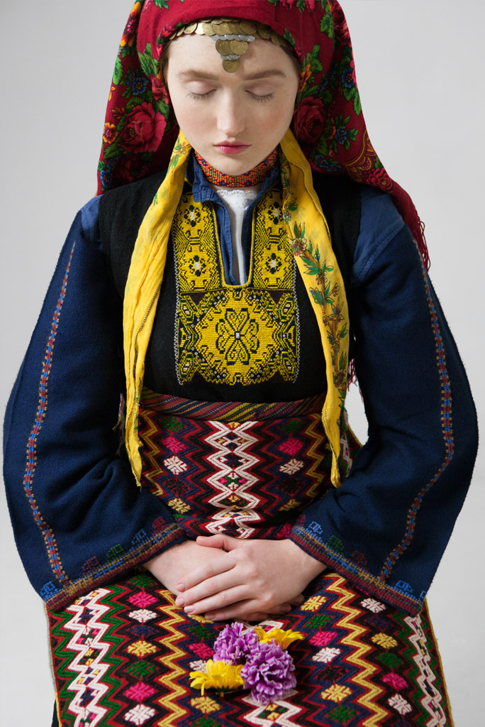
The dark setting, the strict typography and the restrained presentation were chosen deliberately, so that the colour and detail of the costumes themselves always have the first word.
How it came together
- 01
Research & challenge
The name stayed the same; it has been known in the field for decades and is a guarantee in itself. What was missing was an image that matched that reputation and worked equally well in print and digital. We studied the workshop's own pieces, above all the embroideries: they vary from region to region across Greece, but share a common tone — rich curves and, often, gold thread.
- 02
Idea & design
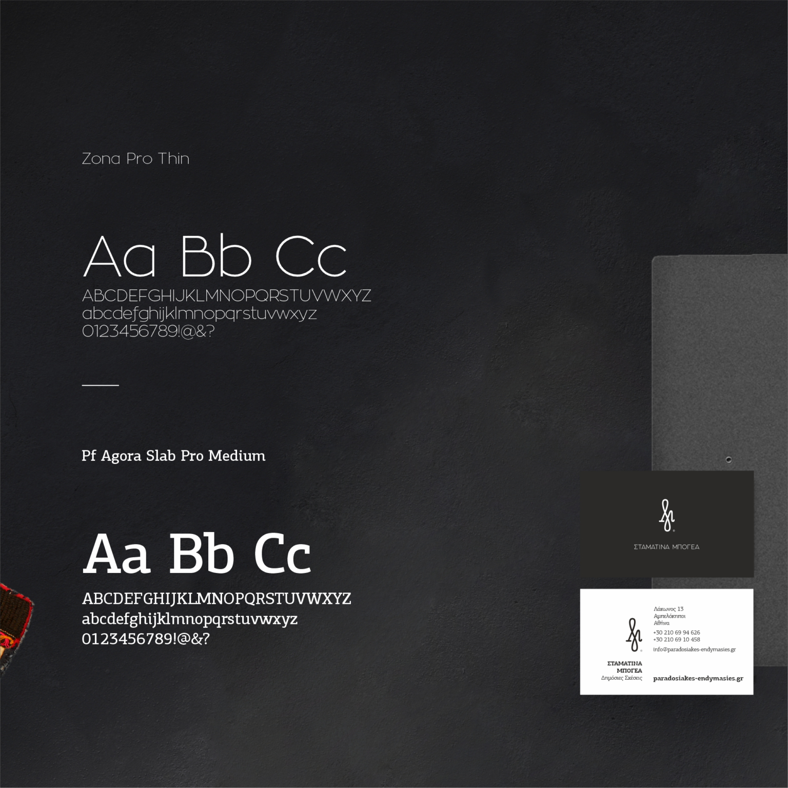
The starting point was the initial of the surname. We drew many versions of the "M" until a shape emerged that tied in with the costume motifs. The mark has no symmetry anywhere: the left side is more squared, the right opens into a curve, and this asymmetry gives it movement. It is accompanied by a classic serif typeface. The palette stays within the scale of black — black, white and the greys in between — with gold details in selected places, exactly where one would find gold thread on the costumes.
- 03
Delivery & result
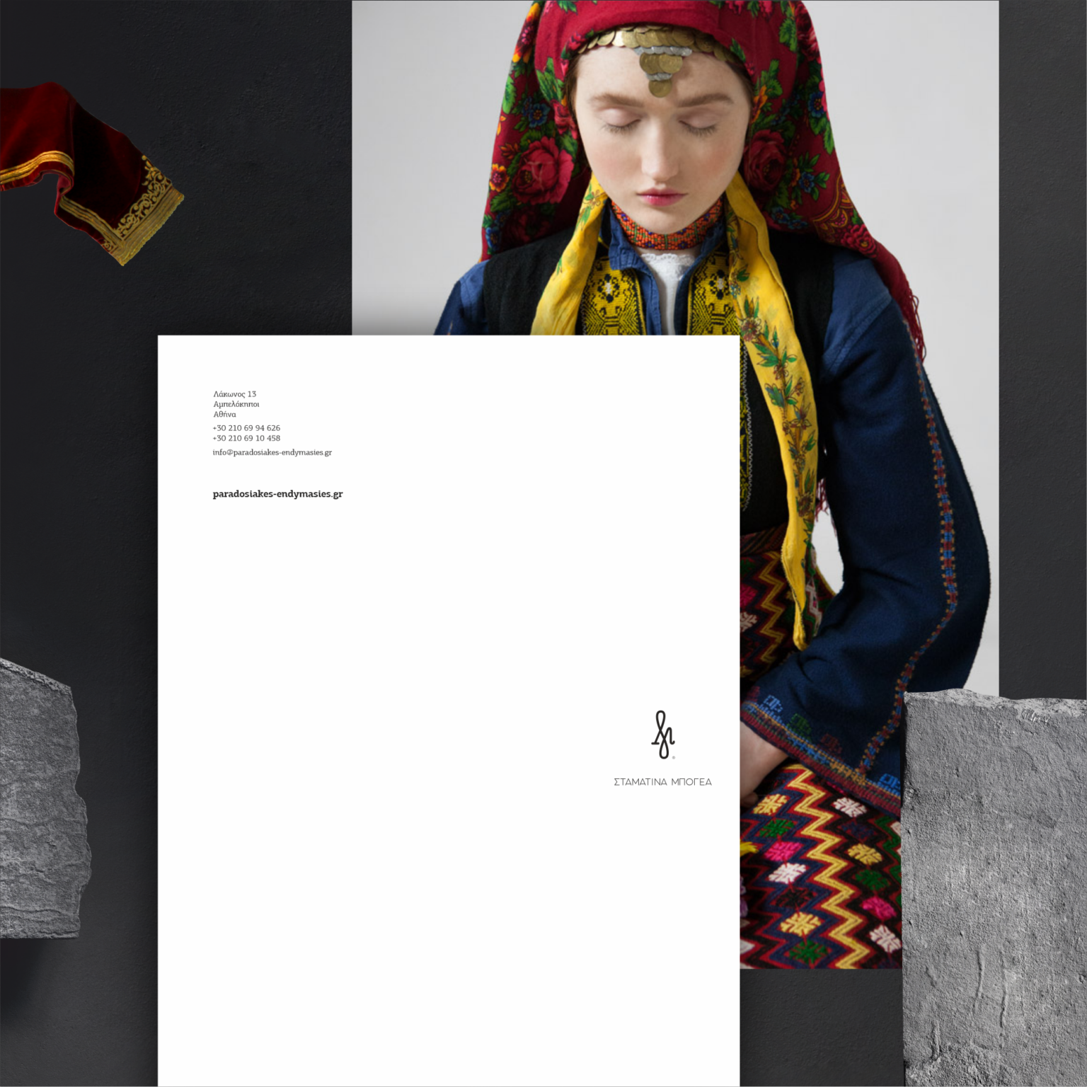
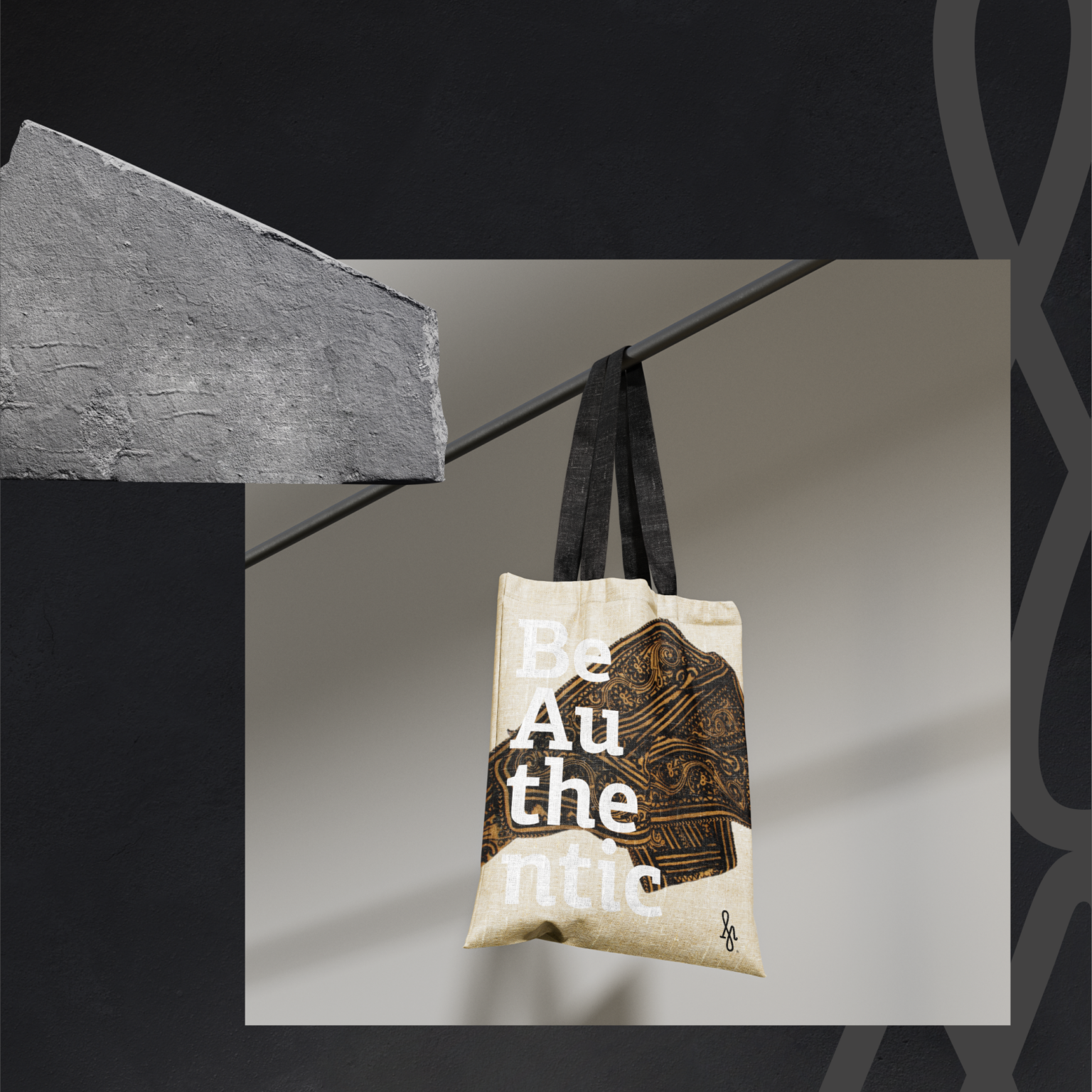
The stationery was printed on black papers with white screen printing and paired with black envelopes. The business card is a composite of two papers, one white and one black, laminated together: white screen printing on the black side, black print on the white. We designed a tote bag that customers loved immediately, the layout of the new website so that it speaks to the identity, and material for social media. We photographed authentic pieces from the collection to promote the business — on their own they are already jewels.