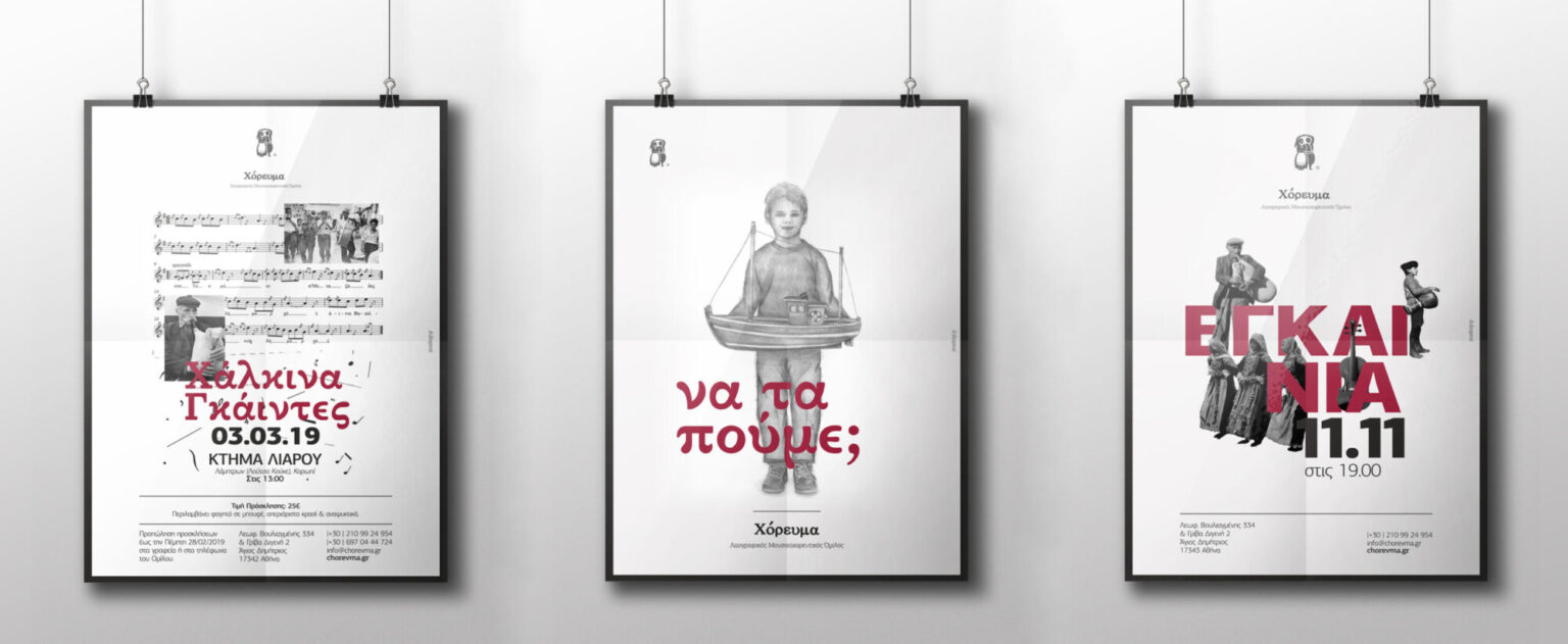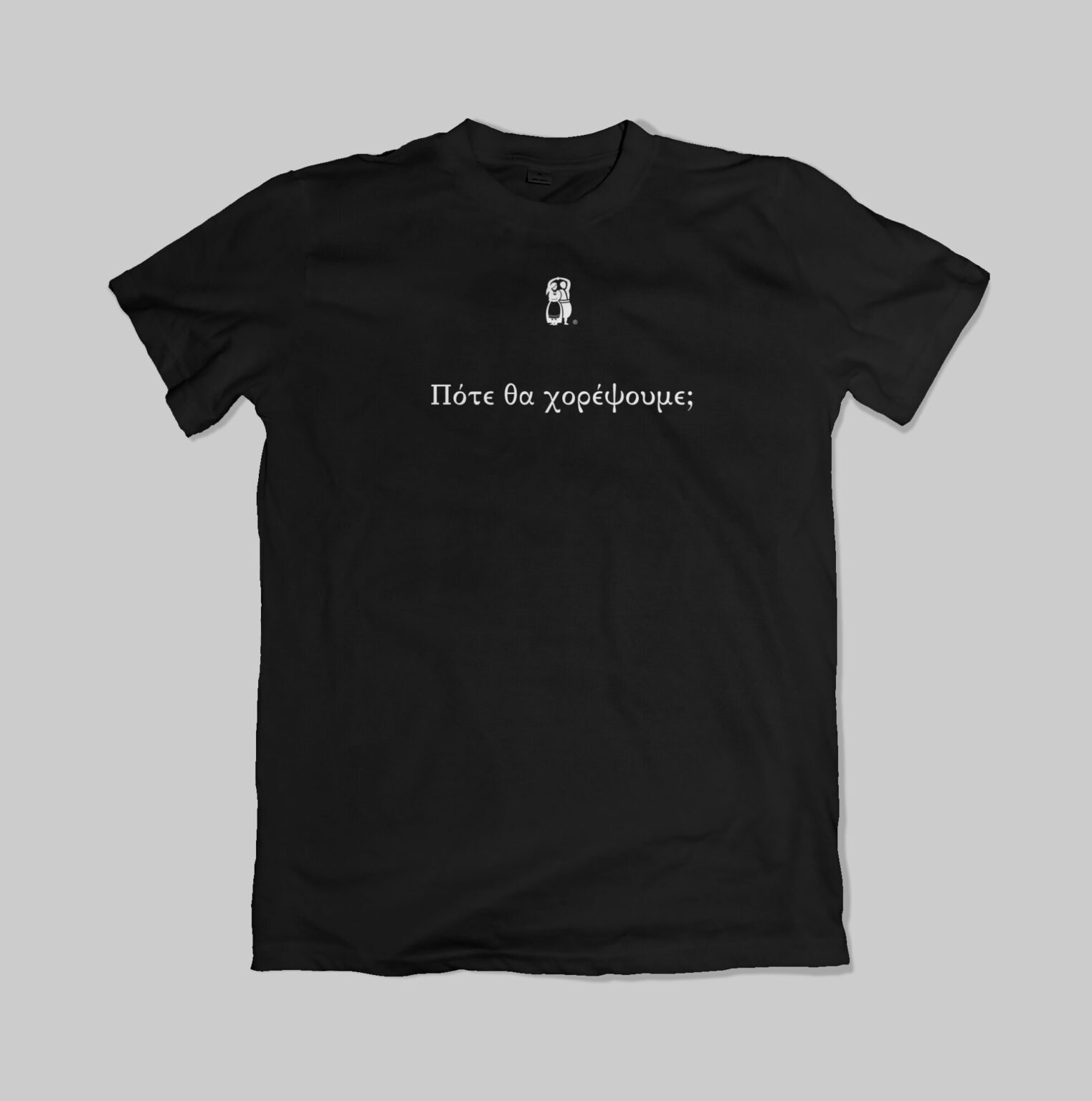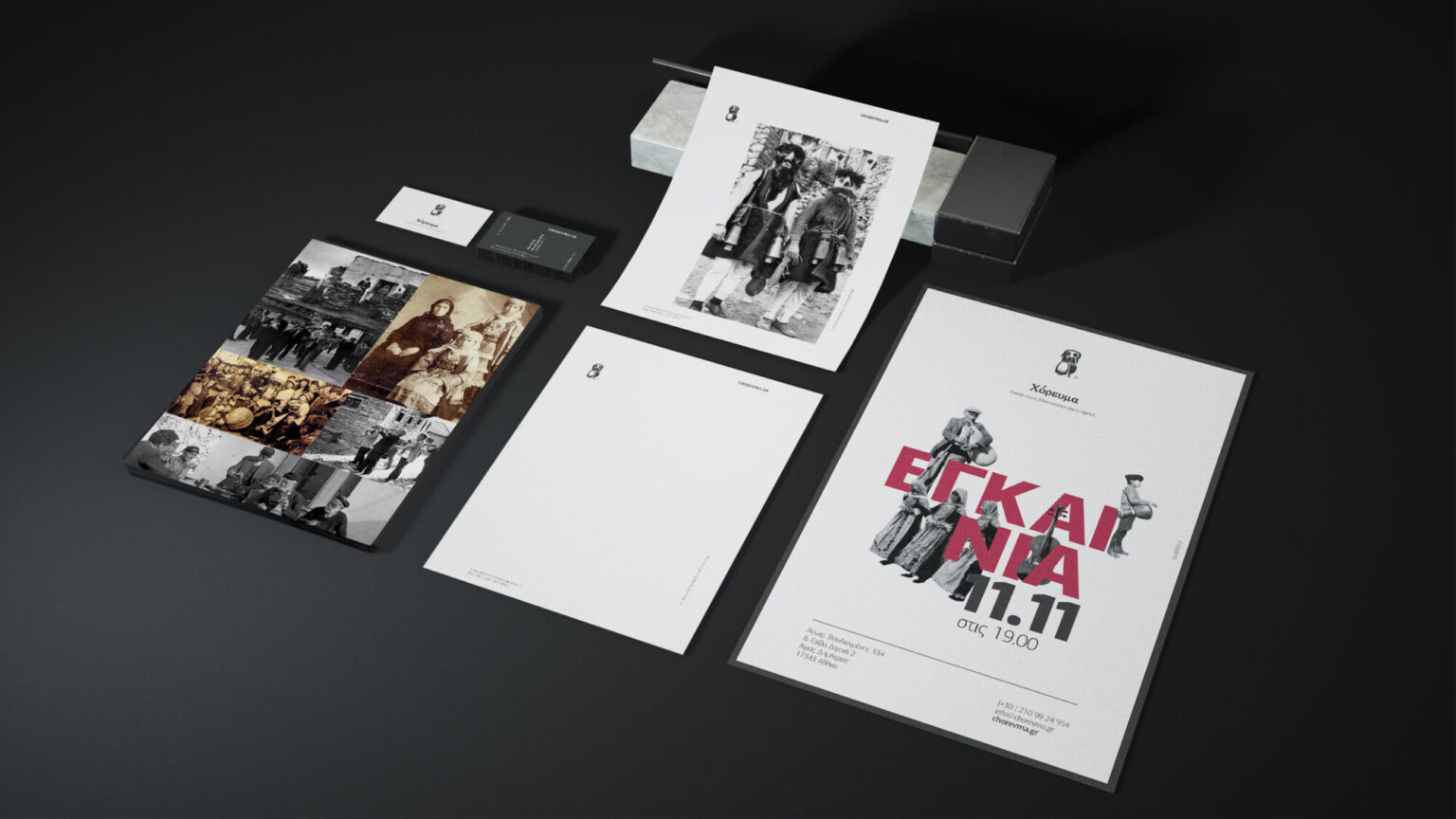
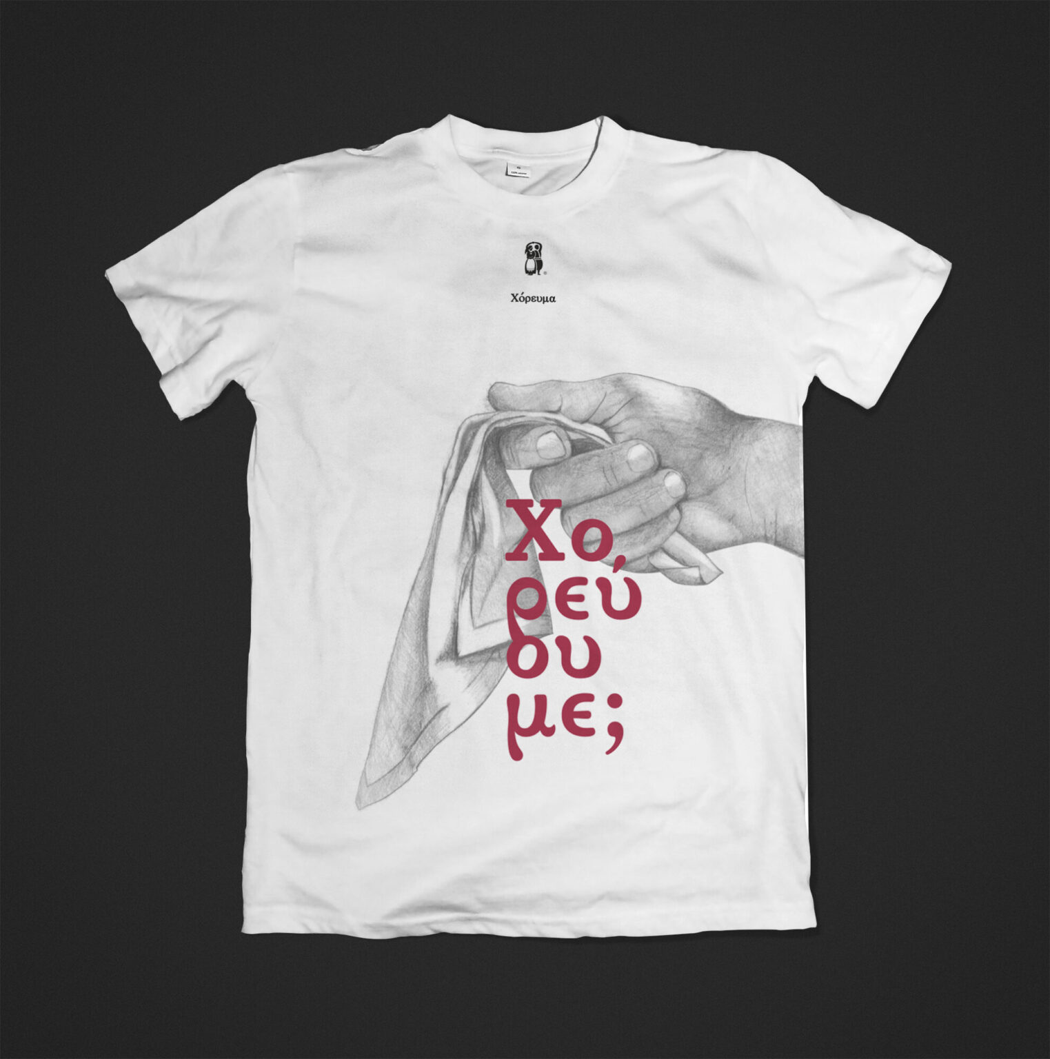
An image that respects Greek folk tradition without imitating it, and that can carry many different applications every year: posters, clothing, calendars, banners and digital material for the class.
We combined the club's photographic archive with hand-drawn illustration and a strict four-tone colour frame.
One unified, recognisable image at every touchpoint, from the poster and the t-shirt to the classroom screen, renewed each year without losing its character.
Logo and visual system for a Greek folk music & dance club in Agios Dimitrios
Chorevma is a Greek folk music and dance club in Agios Dimitrios, Attica, devoted to teaching and performing traditional dances. Its name, Χόρευμα, means a dance performed by many. Poua Design has designed its whole image from day one: logo, corporate identity, illustration and every application needed along the way, in print and digital.
Every project our studio takes on is a challenge for us. We meet new people, we learn the nature of their work and we take part in a dream of theirs coming true. We listen closely, read a great deal about the sector a business works in and look at the competition. After each job we come out richer in experience, knowledge and feeling.
But there are also projects that belong to the dreams of our own people. Dreams we have lived with since their birth, and watched slowly become reality. Chorevma is one of them.
Kanellos, dance teacher, friend and fan of our studio (we might as well say it), asked us to design the visual presence for his new beginning. The name: "Chorevma", which means the dance that is danced by many.
For us Chorevma was something very familiar and dear. We knew its every detail; we were beside it at every step and for every idea that was spoken aloud. Knowing the people who helped bring it about, the club had become part of our everyday life. It had become something that felt like ours.
With all that knowledge and those unique feelings, we began designing the logo. Our first thought was to portray dance in a contemporary way, in tune with our own time, while also carrying something of the past and of our rich tradition. We asked the dance teacher for a photograph of himself with his dance partner. We worked on that photograph and drew two stylised figures in their costumes. In the strongest colour of the time, black, the figure performs the sousta, a dance done by a couple in Crete.
Next we designed the club's corporate identity. Modern elements, like the layout and the typefaces, were chosen to sit in harmony with old photographs of everyday life in Greece. The printing techniques and the paper recall something aged that endures through the years.
What comes next is magical, like the moments we will all live together inside Chorevma. And I, Antigoni, want to say thank you for trusting me. You let me design Chorevma the way I feel it, and create contemporary images around a great love of mine: dance.

How it came together
- 01
Research & challenge
The starting point was the tradition itself: the costumes, their colours and the dance teacher's personal photo archive, with some very old shots. The aim wasn't a mark for a single use, but a language that would accompany the club in everything it does, from the poster for a village feast to the material for a stage performance.
- 02
Idea & design
The identity rests on three materials: archive photographs, hand-drawn pencil sketches in black and white, and a palette of black, grey, white and burgundy, the colours we meet in traditional costumes. The hand-drawn sketch brings a warmth and personal character that no ready-made image can replace. A rule from the start: every new application begins from a clean slate, with its own concept, inside the limits of the identity.
- 03
Delivery & result
Every feast and every performance has its own poster, and every year its own t-shirt for the members. For three to four years the club published an annual calendar with its members dressed in traditional costumes, with an emphasis on headdresses, the part of the costume that reveals a dancer's place of origin. For the class we designed an app for the club's interactive whiteboard, so the dance teacher can present material and brief students right in the lesson. Banners, performance material and many more applications complete a system that grows together with the club.