A family cheese dairy was passing to the third generation and being renovated.
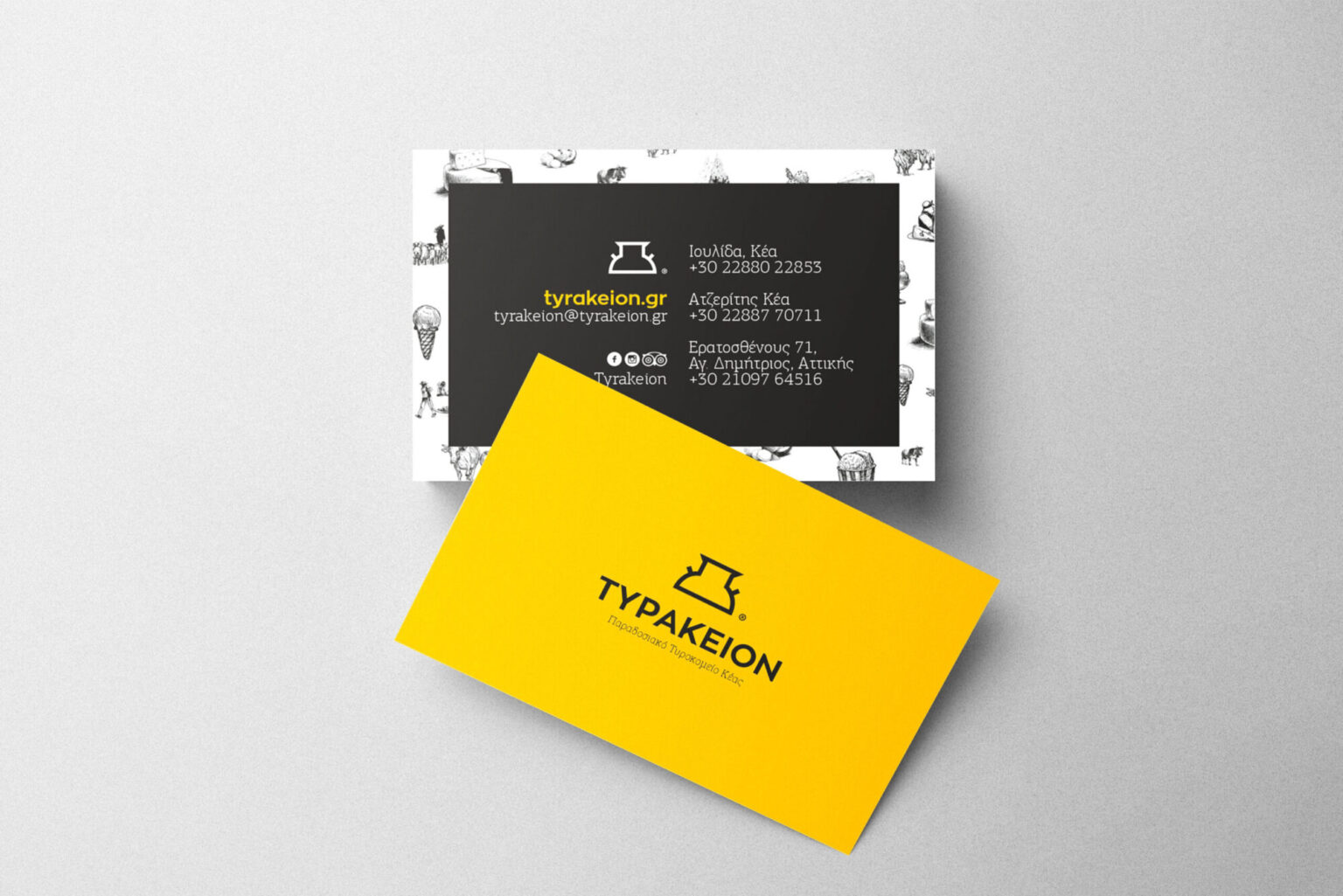
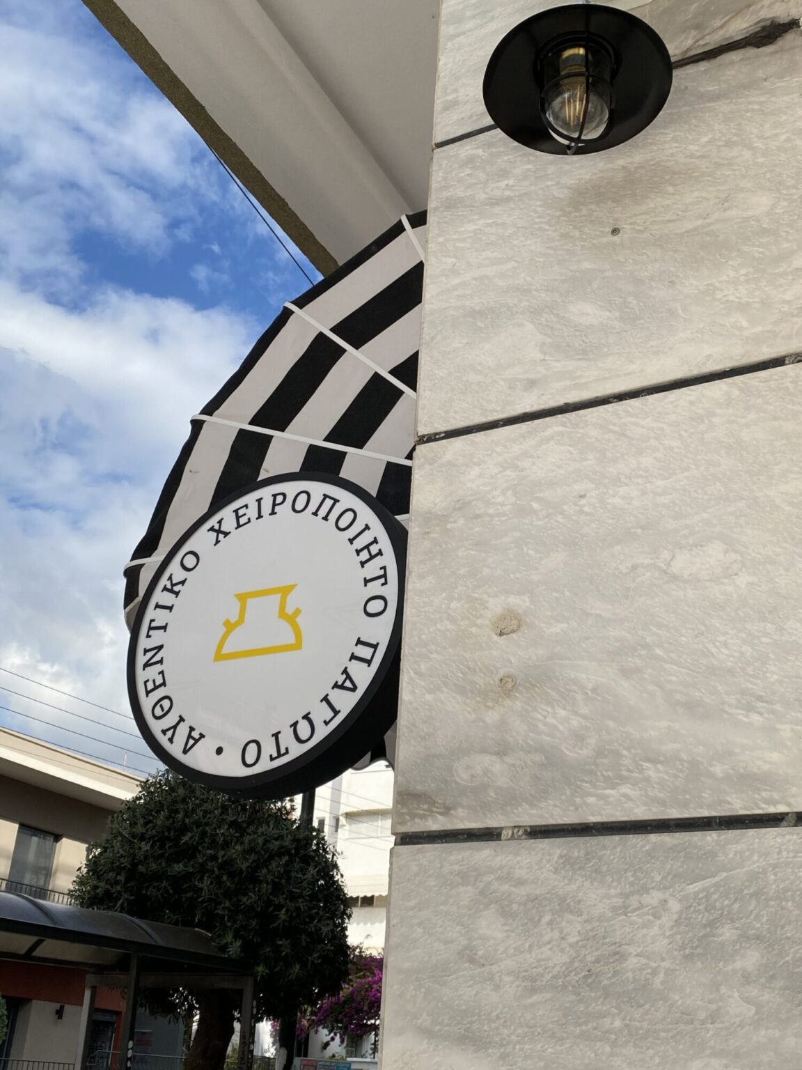
A mark taken from the milk churn, drawn so that it also reads as an abstract "T".
An identity that keeps the tradition of the place and stands on a modern shelf, from the packaging to the shop wall.
Tyrakeion — a traditional cheese dairy on Kea
Tyrakeion is a cheese dairy in the village of Atzeritis on Kea, housed in a stone building of traditional architecture that the family itself renovated. The young owner took the business over from his father and grandfather, and came to us with the name decided and the space ready to change.
The projects I love most are the ones where the symbol already exists somewhere; nobody has simply looked at it as a drawing. The milk churn was there, in every story they told me about the grandfather and the milk. All I did was draw it cleanly and let it become a letter. That is how a business can look contemporary without disowning anything that built it.


How it came together
- 01
Research & challenge
The business was changing hands and premises at the same time: a renovated dairy, a new image, new signage. The brief was the whole of its visual communication, from logo to packaging and print. The balance was the hard part: a new generation wanted a contemporary image without losing the weight of a product made the same way for decades.
- 02
Idea & design
The mark comes from the milk churn, the metal vessel used to carry milk from the milking to the processing. It was drawn so that its outline also works as an abstract "T", the initial of the name. Below it, the name is set in Zona Pro, a clean geometric typeface, with black holding the authority. The system grew through a series of illustrations — cheeses, the moment of transport, the cow, scenes from the daily life of a cheese dairy — in black sketch. Composed together, the sketches became a wallpaper that covers entire walls. To the black and white we added a yellow that isn't bright but deep, just enough to evoke the cheese itself.
- 03
Delivery & result
The identity went first into the Athens shop: wallpaper as the dominant element of the space, signs, business cards and leaflets. We designed the product packaging, banners and an online catalogue from which customers can order directly. When production expanded into sweets and ice cream, we enriched the same system with new elements so the two sides coexist without feeling like strangers — right down to the wheeled bicycle with an awning that serves ice cream at weddings. The collaboration continues with each new need of the business.